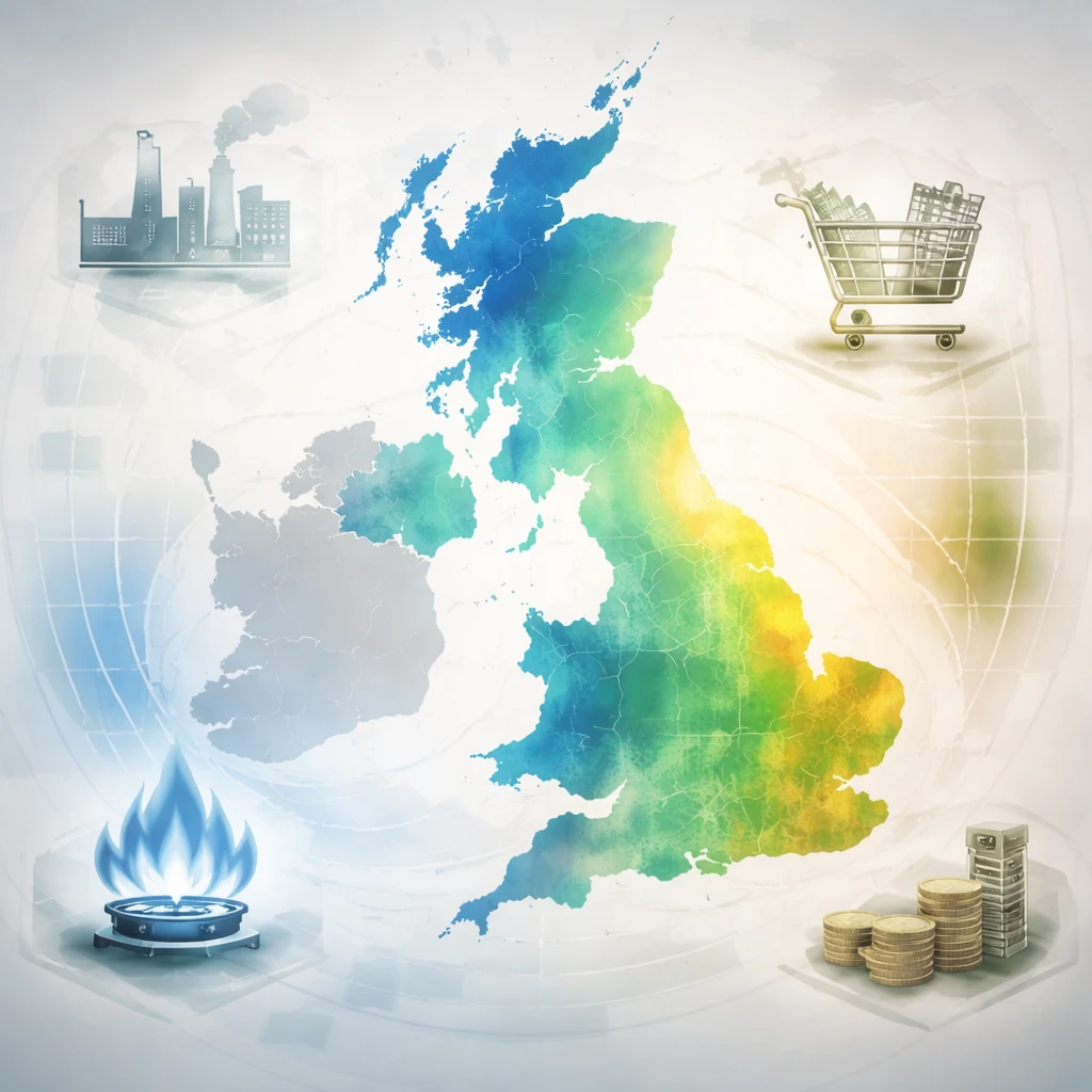
Barclays has built a comparative heat map that places current UK economic indicators alongside those recorded during previous major energy shocks, and reports that the likely second-round effects of the current energy price shock appear more similar to the 2011 episode than to the more inflation-persistent 2022 episode.
The bank emphasized that the wider economic backdrop around an energy shock matters for how the shock propagates through the economy and for how long its effects last. There remains active debate about whether the current pattern will align with the 2011 experience - which showed limited second-round effects - or with 2022, when the inflationary impulse proved more durable.
To bring clarity to that comparison, Barclays adapted recent analytical work produced by the European Central Bank and tailored it to the UK context. The output is a heat map intended to offer a structured way to assess how a set of core supply and demand indicators might shape the inflation response to the current energy shock.
Methodologically, the bank standardized each indicator by converting values into z-scores relative to each series long-term mean. Those standardized measures are then plotted according to their relative z-score for the relevant periods. On the visualization, green denotes periods where conditions are above average and blue denotes periods where they are below average. For certain series the orientation was inverted so that green highlights periods when the directional effect on inflation and inflation persistence is positive, and blue shows the converse.
The analysis therefore combines a selection of supply and demand gauges with a consistent standardization approach to facilitate cross-period comparison. By mapping indicators in this way, Barclays presents a framework to weigh how current conditions compare to prior shocks and to infer whether second-round inflationary pressures are likely to be limited or persistent.
Because the work adapts the ECB framework specifically for the UK, the bank treats the map as a tool for interpreting the balance of pressures that can influence inflation dynamics - rather than as a definitive forecast. The comparison to 2011 and 2022 is presented as a judgment based on the plotted indicator patterns and the chosen standardization method.