Overview
Volume is the count of shares, contracts, or units transacted over a given period, while volatility reflects the variability of price. In technical analysis, distinguishing high volume from low volume provides context for interpreting the significance of a price move. Price change is information, but price change accompanied by the degree of participation adds interpretive depth. When participation expands or contracts, the mechanics of liquidity, transaction cost, and price impact shift, and that shift is visible in common chart formats.
This article defines high and low volume in a practical way, explains how the concept appears on charts, connects volume with volatility, and offers realistic examples of how analysts use the comparison to read price behavior. The goal is to clarify interpretation rather than propose trading actions.
Defining Volume and Volatility
What Volume Measures
Volume counts how many units exchanged hands within the chosen bar or candle. On an equity chart, it is typically the number of shares traded per minute, hour, day, or week. On a futures chart, it is the number of contracts. For cryptocurrency, many platforms report units of the base asset. In foreign exchange, centralized exchange volume is not available for spot markets, so charting platforms often display tick volume, which approximates activity by counting price updates. Each data source has its own conventions, so understanding what the platform reports is essential.
The single period count is only a start. Interpretation usually relies on relative volume. A daily bar with 20 million shares is high for a small-cap equity that averages 2 million, and low for a mega-cap that averages 80 million. Analysts compare current volume to a baseline such as a 20-day average, a 30-day median, or an intraday average pace for the current time of day.
What Volatility Measures
Volatility describes the scale of price fluctuations. Realized volatility can be approximated in several ways. Popular choices include daily true range, intraday high-to-low ranges, or the standard deviation of returns over a rolling window. Implied volatility derived from options prices reflects market expectations, but the charts discussed here primarily visualize realized volatility through candle ranges and gaps. Volume and volatility interact. High participation often arrives when price is moving sharply, yet there are notable exceptions.
High Volume vs Low Volume
High volume means participation materially above the instrument’s recent norm. Low volume means the opposite. The reference point matters. Opening and closing auctions, monthly rebalancing, and earnings releases can produce high volume relative to a 10-day baseline, but may be typical relative to the instrument’s own event history. The same caution applies in the other direction. Thin overnight sessions in index futures or weekend hours in certain digital assets may feature low volume that is normal for that session.
Defining thresholds is contextual rather than absolute. Many analysts label volume as high when it exceeds a multiple of the average, such as 2 times the 20-day average, or when cumulative intraday volume is running far ahead of usual pace for that clock time. Low volume is often described as meaningfully below the baseline for the period under study, such as less than half of typical activity.
How Volume Appears on Charts
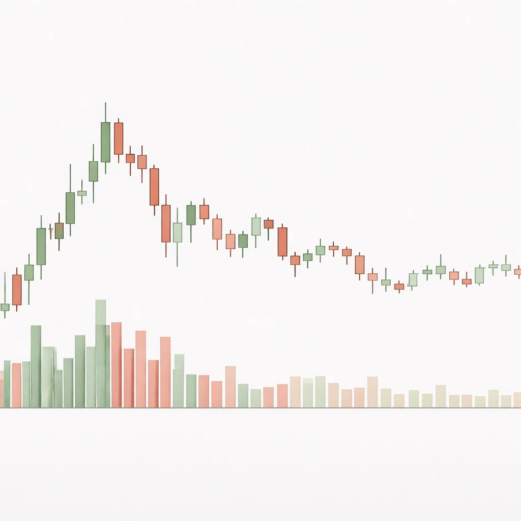
Most charting platforms display volume as a histogram beneath price. Each bar corresponds to the same time interval as the price candle above it. Colors sometimes mirror the candle’s direction. For example, a green volume bar may indicate the period closed above its open, while a red bar indicates the opposite. That coloring convention is not universal and does not imply that every unit of volume was executed on the bid or on the ask. It is a visual convenience, not a literal microstructure count of aggressive buyers or sellers.
On a typical daily chart, high volume days stand out as tall histogram bars that tower over the recent cluster of bars. Low volume days appear as short bars, sometimes forming long sequences during quiet periods. On intraday charts, the diurnal pattern is visible. Participation tends to spike near the open, dip during mid-session, and rise near the close. Recognizing this baseline pattern helps avoid mislabeling routine fluctuations as significant shifts.
Why Market Participants Pay Attention
Volume speaks to how many participants were involved in setting price. A period with elevated participation often reflects broader interest, heightened uncertainty, or information release. This has several implications for how analysts read price behavior.
- Liquidity and execution conditions. High volume often coincides with tighter spreads and deeper order books in centralized markets, which can allow large transfers of risk with less price impact. Low volume can coincide with wider spreads and thinner depth, which increases sensitivity to individual orders and news.
- Price discovery. When new information arrives, more counterparties are motivated to trade. High volume following an information event is a sign that prices adjusted with broad awareness. Low volume moves can still be meaningful, yet they also occur in conditions where fewer participants update their views.
- Durability of moves. Many technicians consider whether a strong price change carried widespread participation. A large price bar on expanded volume is often read as a more consequential step in the price discovery process than an equally large bar on muted activity. This is an interpretive lens rather than a rule.
- Risk estimation. Volume and volatility are connected. Rising participation often accompanies wider ranges, faster tape speed, and more frequent gaps. Observing the mix of volume and range helps set expectations for intraday variability, slippage, and the feasibility of order execution.
Practical Chart Contexts
Earnings Release in an Equity
Consider a stock that reports earnings after the close. The following morning, the chart shows a gap open and the first 30 minutes trade at a volume pace several times the usual rate for that time of day. The daily volume bar later finishes at three times the 20-day average. The price range is wide relative to its recent history. This pairing of high volume and high volatility is common around information events. The high bar in the volume histogram indicates that price changes occurred with significant participation. Analysts record such days as structurally different from routine sessions because the price level was negotiated by many counterparties who updated their valuations simultaneously.
Midday Lull and the Open or Close
On an intraday index futures chart, volume often peaks during the first half hour, fades during lunch hours, then rises into the close. If price drifts upward by a small amount during the lull on low volume, the histogram will show a sequence of small bars. The same amount of price change during the opening burst would appear with tall volume bars. The difference is not a directional signal by itself. It simply situates the move within the daily participation cycle and suggests how much trading interest supported the change.
Low Volume Drift
Suppose a currency pair in the spot market trades through a quiet Asian session. Tick volume shows few updates per minute, and the candles are small. Later, during the London and New York overlap, tick volume jumps and ranges expand. The earlier drift carried low participation, which partly explains the tight spreads of realized returns. The later session features both higher tick volume and higher realized volatility as more participants engage and liquidity conditions change.
Volume Climax and Narrow Ranges
A daily chart can sometimes display a very high volume bar paired with a relatively narrow candle body and long wicks. One interpretation is that substantial two-way trading occurred within a compact range, often described as absorption. The histogram signals high participation, while the candle shape shows that buyers and sellers met aggressively and offset each other. Without invoking strategy, the key informational point is that high volume does not guarantee a large net price change. It can represent a shift in ownership within a bounded range.
Calendar Rebalancing or Index Events
At quarter end, equity index rebalancing can generate high closing volume as funds adjust holdings. Prices may move, but the intent behind the trades is mechanical rather than informational. The volume histogram for the closing bar stands out sharply. This reminds analysts that context matters. High volume generated by benchmarked flows may have different implications than high volume triggered by earnings or macroeconomic news.
Weekend Effects in Digital Assets
Markets that trade continuously often show lower participation on weekends. Charts of certain digital assets frequently display shorter volume bars and tighter ranges on Saturdays compared with weekdays. During these low activity windows, the order book can be thinner, and individual prints can move price more easily. Reading the histogram alongside the candle ranges helps explain the observed sensitivity.
Measuring and Comparing Volume
Interpreting high versus low volume relies on disciplined comparison to a baseline. Several practical measures are common.
- Moving average volume. A simple or exponential average over 10 to 50 periods is often used as a benchmark. Plotting the average on the histogram offers a visual reference. The ratio of current volume to this average provides a quick relative label such as 1.2 times or 3.0 times.
- Relative volume by time of day. Intraday activity follows a predictable shape. Comparing the current cumulative volume to the expected amount for that clock time accounts for this pattern. Many platforms display an intraday volume pace indicator that shows whether trading is ahead of or behind typical pace.
- Median as baseline. A median can be more robust to outliers than a mean. A single event day with extreme volume can distort a short moving average. Medians reduce this effect and give a steadier benchmark for classifying subsequent days.
- Volume adjusted to float or shares outstanding. For equities, comparing daily volume to float or shares outstanding gives a sense of turnover. A day with 50 percent of the float traded is qualitatively different from a day with 5 percent, even if both exceed the recent average.
- Cross-venue consolidation. For assets trading on multiple venues, consolidated volume provides a fuller picture. Platform-specific charts may show only partial activity. Interpretation is more reliable when the dataset covers the major venues relevant to the instrument.
Analysts also consider ratios that combine volume and price movement.
- Volume per unit of range. Dividing volume by true range highlights how much activity occurred per unit of price movement. A high value signals heavy trading within a relatively contained range, while a low value indicates large price swings on comparatively modest participation.
- Range per unit of volume. The inverse emphasizes price impact. Large ranges on low volume suggest that small amounts of flow influence price more readily, often in thin conditions.
VWAP, the volume weighted average price, is a commonly referenced benchmark that summarizes the average price at which the day’s volume exchanged. While VWAP is often used for execution analysis, its value in this discussion is descriptive. When volume is concentrated in a narrow price zone, the day’s VWAP tends to sit within that zone and the volume histogram displays tall bars aligned with the period when most trading occurred.
In markets without centralized volume reporting, tick volume provides a practical proxy. It counts price changes per period rather than the size of trades. While imperfect, tick volume often correlates usefully with underlying activity and is interpreted similarly in high versus low regimes. The limitation is that it cannot tell how many units were exchanged per tick, only that activity accelerated or slowed.
Volume and Volatility Together
Volume and volatility are related but not interchangeable. It is useful to think in terms of regimes.
- High volume and high volatility. Common during earnings, macro releases, or breaking news. Price ranges widen as many participants update quotes and transact. The histogram shows tall bars, and candles often expand or gap. Execution is active, but slippage can increase as price moves quickly.
- High volume and low volatility. Occurs when two-way flow is strong within a contained range. Rebalancing days and absorption near well-watched price levels can produce this mix. The histogram is elevated, but candle bodies may remain moderate, often with wicks on both sides.
- Low volume and high volatility. Thin conditions can lead to outsized moves from relatively small orders. Overnight sessions for futures or weekend trading in some markets occasionally show this regime. The histogram is short while candles stretch.
- Low volume and low volatility. Typical of quiet sessions with little new information. Price may drift in a small range, and the histogram displays a series of shallow bars. Analysts interpret such periods as low participation and low urgency.
Visualizing these regimes can be done informally by scanning a chart for combinations of histogram height and candle range, or more formally by calculating averages over rolling windows and classifying periods. Either way, the point is to integrate the two dimensions rather than read volume or volatility in isolation.
Microstructure and Calendar Effects
Patterns in volume are shaped by market design and calendars.
- Opening and closing auctions. Many equity markets match a large number of orders in single prints at the open and close. Volume bars for those intervals are routinely elevated. Interpreting them requires awareness that the mechanism differs from continuous trading during the rest of the session.
- Scheduled news. Economic releases, central bank announcements, and earnings calls tend to concentrate activity around specific times. Volume and volatility rise together into and after these events, then normalize as information is absorbed.
- Options and futures expirations. Expiry and rollover often generate high volume that can be mechanical. Prices can be stable or choppy depending on positioning, but the histogram typically shows spikes.
- Holidays and seasonality. Activity often declines around holidays and in specific seasonal windows. Interpreting low volume during such periods requires adjusting expectations to the seasonal baseline.
- Crossing networks and dark venues. Some trading occurs off lit exchanges. Reported consolidated volume may reflect this with a delay or not at all, depending on the market. The visible histogram is an approximation of total activity, not a perfect census.
Data Quality and Interpretation Limits
Volume data is not immune to reporting quirks. Consolidated equity feeds may revise prints, double count or break out late reports from alternative venues, or attribute activity to the wrong interval. Futures volume can jump around contract roll dates as liquidity migrates to the next contract. Cryptocurrency exchange volumes vary in reliability across venues and time. For foreign exchange, tick volume varies by data provider. These issues do not make volume unusable, but they do encourage conservative interpretation and careful sourcing.
Coloring conventions on volume bars add another layer of potential confusion. A green volume bar does not mean all trades were initiated by buyers. It usually means the candle closed higher than it opened. Some platforms color by close-to-close change instead. Understanding the platform’s logic prevents incorrect inference about aggressor side or order flow dominance.
Reading Volume Colors and Aggregation Choices
Aggregation choices change interpretation. On a weekly chart, a major earnings day may be one fifth of the bar. The weekly histogram’s height reflects the sum across all sessions, which can mask day-level spikes. Conversely, on a one-minute chart, an aggressive block print can produce a single towering bar. Neither view is wrong. They answer different questions. When analysts refer to high volume, they usually mean high relative to the baseline of the timeframe they are analyzing.
Colors, if used, should be understood as direction indicators rather than actual buying or selling pressure. Some chartists prefer neutral coloring for volume to avoid psychological bias. Others include a moving average of volume on the histogram to anchor the eye.
Timeframe Dependence
The significance of high versus low volume changes across timeframes.
- Intraday. High volume relative to time-of-day norms suggests the market is processing new information or that liquidity is momentarily concentrated. Low volume often coincides with narrow spreads of realized returns and modest tape speed.
- Daily to weekly. Event days stand out clearly. High volume with a large weekly range often marks a week when many participants updated positions. Conversely, a string of low volume weeks can indicate consolidation or seasonal quiet markets.
- Monthly and beyond. Structural shifts such as index additions, large share issuance, or corporate actions can alter the baseline of what counts as high or low. Using stale averages risks misclassification after a regime change.
A practical habit is to refresh the baseline after known structural events or at reasonable intervals, and to keep comparisons within the same timeframe when discussing high or low.
Putting the Pieces Together
Reading a chart for high versus low volume involves three coordinated questions.
- Compared with a relevant baseline, was participation elevated or muted in the period under study
- How did realized volatility behave at the same time, as shown by candle ranges, gaps, and true range measures
- What contextual factors could explain the pairing of volume and range, such as earnings, rebalancing, holidays, or session time
Answering these questions does not forecast the next move. It builds a consistent narrative about how price was discovered, how many participants contributed to that discovery, and what execution conditions likely prevailed while the move unfolded. That narrative, carried forward from period to period, gives structure to the analyst’s reading of the market without relying on a single indicator or signal.
Key Takeaways
- High volume and low volume are relative concepts that must be judged against an appropriate baseline for the instrument and timeframe.
- Volume histograms highlight participation, while candle ranges visualize realized volatility. Interpreting them together is more informative than reading either in isolation.
- Context matters. Events, auctions, rebalancing, and session time can generate high volume without implying a directional view.
- High participation often coincides with wider ranges, yet high volume can also occur within tight ranges when two-way flow is strong.
- Data quality, coloring conventions, and aggregation choices can affect interpretation. Understanding the source and method improves reliability.