Introduction
Trend analysis sits at the center of technical interpretation. Analysts study whether price advances or declines persist, how swings form, and where structure changes. Despite its apparent simplicity, trend work is prone to systematic mistakes. These mistakes do not arise from a lack of tools but from how charts are read and how information is selected or ignored. Understanding common errors helps prevent mislabeling of market phases and encourages a disciplined reading of price behavior.
This article reviews frequent errors that occur when identifying trends and market structure. It describes how the errors appear on charts, why market participants pay attention to them, and provides practical context through examples. The focus is on interpretation rather than strategy. No recommendations or trade instructions are offered.
What Trend and Market Structure Mean
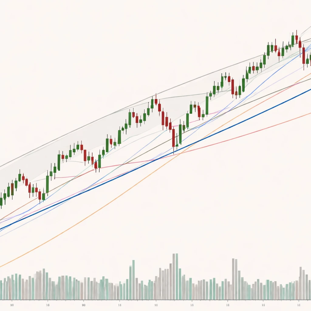
A trend is a directional bias in price movement over a defined period. In a simple description, an uptrend is a progression of higher highs and higher lows. A downtrend is a progression of lower highs and lower lows. Market structure refers to the arrangement of swings, consolidation areas, gaps, and breakouts that form the recognizable shape of price evolution. Structure provides the scaffolding from which trend judgments are made.
Because markets are fractal, the same basic structure can appear on multiple timeframes. A daily uptrend can contain intraday downtrends. This creates a need to specify the timeframe and swing definition used for any trend judgment. Most common errors stem from either vague definitions or inconsistent use of those definitions.
Defining the Concept of Common Trend Analysis Errors
Common trend analysis errors are recurring mistakes in reading or labeling trends and market structure. They include misidentifying swing points, forcing trendlines to fit a narrative, ignoring the influence of timeframe and volatility, and treating indicators as substitutes for structure. They also include cognitive and measurement biases, such as confirmation bias, hindsight reconstruction, and misuse of chart settings.
These errors usually appear on charts as cluttered drawings, inconsistent anchor points, or abrupt reclassifications of trend after routine fluctuations. They often coincide with periods of elevated volatility, crowded narratives, or strong emotional reactions to news. Recognizing these patterns on the chart does not predict what price will do next. It helps maintain a coherent map of what price has done and how current action fits within that map.
Why Analysts Pay Attention to These Errors
Mistakes in trend labeling create downstream distortions in any subsequent analysis. If the structure is misread at the outset, risk assessments, scenario trees, and expectations about continuation or exhaustion become less reliable. Avoiding these errors is not about forecasting. It is about maintaining consistency, avoiding overreaction to noise, and protecting the integrity of comparative studies across assets and timeframes.
Experienced practitioners pay attention to these pitfalls because they complicate communication as well. Clear and consistent structure language allows analysts to compare notes, review case studies, and evaluate historical analogs without talking past each other.
How Errors Appear on Charts
On the chart itself, common errors often show up as visual contradictions:
- Trendlines that hop from wick to body without a stated rule, producing changing slopes with each redrawing.
- Channels fitted to outliers that ignore most of the swing action.
- Frequent declaration of reversal after a single bar undercuts a prior low intraday but closes back within the range.
- Indicators used as primary evidence of trend without reference to swing structure or context.
- Mixed timeframes on one conclusion. For example, labeling a strong daily uptrend while citing a five-minute lower high as proof of reversal.
Each of these visual cues suggests a definitional issue, a measurement inconsistency, or a context mismatch.
Market Structure Essentials That Anchor Trend Work
Several building blocks help anchor any trend discussion:
- Swings: Alternating pushes in price that form peaks and troughs. Clear labeling requires a rule for when a swing is confirmed.
- Breaks of structure: Movement through a relevant prior swing high or low on a closing basis or by a specified margin.
- Trendlines and channels: Visual approximations of slope. They are descriptive, not definitive.
- Volatility regime: The average amplitude and speed of price changes. It influences how much noise intrudes on swing definitions.
- Timeframe alignment: The relationship among trend labels on different sampling intervals.
With these elements in mind, the following sections catalog frequent errors.
Error 1: Misidentifying Swing Highs and Lows
The most basic mistake is labeling a swing too early or too late. Early labeling occurs when a local pivot is called a swing high before any subsequent decline confirms it. Late labeling occurs when confirmation rules are so strict that structure lags, causing multiple reclassifications later.
How it appears on charts: Pivots are marked on nearly every small fluctuation in a volatile segment, then removed or relabeled as price expands. Alternatively, no pivots are marked for long stretches, and the analyst later compresses the chart to justify a cleaner sequence.
Why it matters: Swing labels drive the identification of higher highs and higher lows. Mislabeling one leg can invert the interpretation of the entire trend sequence.
Practical context: Consider a daily chart that rises for five weeks, then prints a single deep pullback with a long lower wick that briefly undercuts the prior higher low during the day. If the swing rule uses closing levels, the uptrend may remain intact. If intraday extremes define structure, a temporary undercut looks like a break. Both are defensible if stated in advance. The error emerges when the rule changes after the fact.
Error 2: Forcing Trendlines to Fit the Narrative
Trendlines are helpful when they summarize many touchpoints and capture slope with minimal error. Problems arise when a line is forced through outliers or when anchor points change whenever price action challenges the current interpretation.
How it appears: A rising trendline initially touches three higher lows on closing levels. When a new low breaks the line, a replacement line is drawn using intraday wicks so the trend appears unbroken. Later, yet another line is drawn at a new slope. The chart accumulates multiple lines with no clear rule for selection.
Why it matters: The line loses descriptive integrity. Observers cannot tell whether slope changes reflect a real change in behavior or a change in drawing method.
Practical context: Many analysts prefer stating an anchor convention. Some use the first two reaction lows to project a preliminary line, then require at least a third touch for validation. Others use closing prices only. The important point is consistency. Inconsistent anchoring is the error, not the choice of anchor itself.
Error 3: Confusing Trend Filters with Trend Itself
Moving averages and other trend filters are descriptive tools. They smooth noise and create a visual separation between price and its recent mean. A recurring mistake is to treat a moving average cross or a single breach as definitive evidence of a new trend without reference to structure.
How it appears: Price whipsaws around a popular moving average during a sideways phase. Each cross is labeled as the start of a new trend. After several false starts, the chart is covered with arrows and notes, while the swing structure would have indicated a consolidation.
Why it matters: Filters are most informative when they confirm a structure already visible in swings and breakouts. Used alone, they respond to noise and regime shifts with little context.
Practical context: In a steady advance with shallow pullbacks, price may close below a short moving average for one or two sessions. If higher lows remain intact, the structural uptrend persists. Treating every close below the average as a structural break conflates smoothing mechanics with market behavior.
Error 4: Ignoring Timeframe Relationships
Trends are nested. A weekly uptrend can accommodate a daily correction, which can include several intraday downtrends. A frequent error is to make a strong statement using one timeframe while ignoring the anchor timeframe that governs the main bias of interest.
How it appears: A chartist calls a reversal on a 15 minute chart because two lower highs have formed. The daily chart still shows higher highs and higher lows. The next day, the 15 minute sequence resets to higher highs without ever affecting the daily structure.
Why it matters: Misaligned timeframes create contradictory labels and emotional whiplash. Clarity requires specifying which timeframe defines the primary trend and how lower timeframes are interpreted within it.
Practical context: An analyst studying swing trades on the daily chart might use the hourly chart for detail. The error is to let a minor lower high on the hourly chart redefine the entire daily trend without structural confirmation at the daily level.
Error 5: Overlooking Volatility Regimes
Volatility expansion increases the amplitude of swings. During such periods, shallow pullbacks become deep retracements. Applying the same swing threshold from a low volatility regime to a high volatility regime produces frequent false breaks or delayed recognition.
How it appears: A chart that previously respected a 2 percent pullback rule begins to oscillate by 4 to 6 percent per leg. The analyst continues to mark each 2 percent fluctuation as a swing reversal, which multiplies the number of labels and fragments the trend.
Why it matters: Trend classification that ignores volatility treats routine noise as structural change or, in the opposite direction, ignores genuine breaks.
Practical context: Many practitioners adapt swing thresholds or require confirmation through closes during high volatility phases. The core error is failing to recognize that the noise floor has changed.
Error 6: Treating Intraday Undercuts as Durable Breaks Without Context
Wicks that probe below a prior low can be significant, or they can be tests that immediately reverse. Without a rule about whether structure is based on closes or extremes, undercuts are often overinterpreted.
How it appears: An intraday spike drives price below a prior swing low for minutes, then price closes back above. The chart is labeled as a downtrend because the low was breached by a small margin, then the label is revoked the next day.
Why it matters: Frequent reclassification on small probes clouds the structural picture and increases the chance of reading noise as signal.
Practical context: Analysts sometimes distinguish between a marginal undercut and a decisive break, using criteria such as percentage distance, volume confirmation, or the duration of trade below the level. The error arises when those criteria are missing or are applied inconsistently.
Error 7: Overfitting Channels and Slopes
Channels can summarize the typical path of price within a trend. Overfitting occurs when a channel is redrawn to touch every oscillation, producing an illusion of precision.
How it appears: After each new swing high, the upper boundary is nudged to include the latest wick. After each swing low, the lower boundary is moved as well. The channel becomes a moving target.
Why it matters: A channel that changes with every swing does not describe a stable behavior. It becomes a sketch of the past rather than a framework for interpreting the present.
Practical context: A well anchored channel often tolerates minor overshoots and undershoots. Trying to eliminate all deviations with redraws signals overfitting.
Error 8: Ignoring Volume and Participation
Volume is not required for trend identification, but it can help contextualize moves. A common error is to label a breakout or breakdown as structurally decisive without considering whether participation expanded or contracted.
How it appears: A price pushes above a prior swing high on very low volume after a long consolidation. The move is labeled as a new impulse leg without hesitation. The next day price returns to the range.
Why it matters: Thin participation makes price more fragile. While structure is defined by price, volume provides corroboration. Ignoring it does not always mislead, but it increases the risk of misclassification in marginal cases.
Practical context: Some analysts note relative volume on breakout days or compare average volume across legs. The error is not the absence of a volume rule. The error is declaring structural conclusions in contexts where participation information would be material, then later appealing to volume only when outcomes disappoint.
Error 9: Misreading Consolidation as Trend and Trend as Consolidation
Sideways phases can be deceptive. They contain many small swings and frequent touches of moving averages. Analysts sometimes call trend where there is none, or dismiss an early-stage trend as noise because the slope is shallow.
How it appears: During a range, a few directional bars are labeled as a new trend, followed by immediate mean reversion. During an early stair-step advance, repeated small pullbacks are labeled as a range until the move is mature.
Why it matters: Misclassification of phase changes the expectations about swing duration and amplitude, which affects how one interprets later tests of structure.
Practical context: Consolidations often show overlapping bars, alternating closes, and equality of swing distances. Persistent trends often show non-overlapping progress and imbalances in swing length. The error is to rely on a single attribute, such as touching a moving average, to define the phase.
Error 10: Narrative and Confirmation Bias
Cognitive bias often drives chart labeling. Once a narrative is formed, new lines and levels are drawn to support it. Counterevidence is discounted or excluded.
How it appears: Only the trendlines that support the preferred direction are left on the chart. Failed breakouts are removed from view. The timeframe that contradicts the preferred narrative is not shown.
Why it matters: Biased labeling lowers the evidentiary value of the chart. Peer review becomes difficult because the chart is curated to a conclusion.
Practical context: A simple discipline many analysts adopt is to preserve prior labels and drawings in versions, even when they are later invalidated. The presence of mistakes on the chart is not a problem. Erasing them until only successful instances remain is the problem.
Error 11: Data and Display Settings
Chart settings can materially change perceived structure. The two most common issues are scale choice and data treatment.
Logarithmic versus linear scale: On long historical charts or with large percentage moves, a linear scale exaggerates recent swings. Slopes that look parabolic on a linear scale appear more proportional on a log scale. Misinterpretation of slope due to scale choice is a routine source of error.
Smoothing and aggregation: Heavily smoothed data or irregular session aggregations can hide gaps, wicks, or important intraday structure. Conclusions drawn from a smoothed series may not match those from the raw bars.
Data quality: Bad ticks, survivorship bias in index constituents, and symbol changes can create artificial breaks or continuity that never occurred. Trend judgments based on flawed data are inherently unstable.
Error 12: Treating Exceptional Events as Ordinary Structure
News shocks, rebalances, and policy events can create gaps and extreme candles. Labeling those moves as routine trend action can distort the trend map.
How it appears: A gap that jumps several average true ranges is incorporated as another step in an orderly channel. Subsequent oscillations that digest the gap are labeled as breakdowns or breakouts based on the channel that never accounted for the shock.
Why it matters: Exceptional events reset participation, liquidity, and reference levels. Trend work benefits from recognizing that such events may define a new regime rather than an extension of the old one.
Error 13: Extrapolating Symmetry Where None Exists
Price sometimes advances in clean stair-steps, but symmetry is not guaranteed. Expecting equal legs, equal durations, or perfectly parallel channels can be misleading.
How it appears: A measured move is projected with identical length and duration to the prior leg. When price deviates, the projection is repeatedly forced to new anchors to preserve symmetry.
Why it matters: Symmetry is an observation, not a requirement. Treating it as an assumption increases the chance of mislabeling normal variation as error or reversal.
Three Practical Chart Contexts
Example 1: Intraday Undercut in a Daily Uptrend
Assume a daily chart that has produced four consecutive higher highs and higher lows over eight weeks. A news item catalyzes a sharp intraday drop that briefly falls 0.6 percent below the prior daily swing low, then closes 0.9 percent above that low. The next day price resumes higher. An analyst who defines structure by daily closes would maintain the uptrend label. An analyst who defines structure by intraday extremes would record a break and reestablishment of trend. The error would be to swap definitions after the event to justify either interpretation.
Example 2: Channel Overfit in a Sideways Market
Consider a two month range with roughly equal swing highs and lows. An upward channel is drawn after the first week of gains. Each time price touches the upper line, the line is adjusted to include the new wick. Each time price touches the lower line, the lower boundary is shifted. After several adjustments, the channel appears to contain all action perfectly. The next move violates the channel immediately. The analyst concludes that the trend broke, when in fact the prior redraws ensured that almost any move would look like a break. The overfitted channel created false clarity.
Example 3: Timeframe Mismatch During a Pullback
A weekly chart shows a steady uptrend. On the daily chart, a three day pullback produces a lower high and a lower low relative to the previous week. The hourly chart contains several short sequences of lower highs and lower lows. Declaring a major reversal based on the hourly patterns alone ignores the weekly structure. As the pullback ends, the hourly sequence flips to higher highs and eventually the daily chart prints a new swing high. The weekly uptrend never changed. The misclassification arose from using the hourly chart to label the weekly trend.
Organizing a Consistent Approach to Reduce Errors
There is no single correct rule set for trend analysis. What improves reliability is internal consistency. The following practices focus on measurement and labeling clarity, not on trading actions.
- Define swing confirmation: Decide in advance whether swings are confirmed by intraday extremes, by closing levels, or by a percentage or price filter. State how much overlap or retracement is tolerated before a swing is invalidated.
- Specify timeframe hierarchy: Identify the primary timeframe for trend classification and how lower timeframes are used. Document conditions under which a lower timeframe can imply a change in the higher timeframe label.
- Anchor drawing rules: Record whether trendlines are anchored to closes or wicks. Require a minimum number of touches before a line is treated as descriptive.
- Note the volatility regime: Track average range or a comparable measure so that swing thresholds can be interpreted relative to current noise levels.
- Preserve versions: Save chart states over time to avoid hindsight reconstruction. Earlier labels provide an audit trail for how the interpretation evolved.
- Check display settings: Confirm scale choice, data adjustments, and aggregation conventions, especially on long histories or during large percentage moves.
Why Avoiding These Errors Improves Interpretation
Eliminating common errors does not produce a prediction model. It reduces misclassification and enhances the ability to compare structures across assets and regimes. It helps distinguish noise from meaningful change, which is the central task of market structure analysis. When labels are consistent and rules are stable, remaining disagreements among analysts are more likely to reflect genuine ambiguity in the market rather than artifacts of measurement or bias.
Additional Notes on Indicators and Structure
Indicators can support trend analysis, but they often inherit the same issues as raw price series. Oscillators behave differently in trends than in ranges. Moving averages are late during reversals and noisy during consolidations. The error is not in using indicators. The error is to grant them primacy without cross checking against swing structure, participation, and timeframe context.
A useful mindset treats indicators as secondary evidence. If the swing map and phase identification are coherent, indicators provide nuance, such as confirming momentum loss or highlighting divergence. If the swing map is incoherent, indicators cannot repair the underlying structural confusion.
Putting It Together on a Clean Chart
A clean chart that resists common errors usually shares several traits. Swing points are labeled using one transparent rule. Trendlines are sparse, anchored consistently, and accompanied by an acknowledgment that lines describe slope rather than govern it. Channels, if used, are drawn to summarize behavior, not to imprison every fluctuation. The timeframe for the main label is declared, and lower timeframe observations are presented as detail within that frame, not as overriding judgments. Volume or participation context is referenced when a structural change is borderline. Scale choices are justified for the horizon studied. Finally, exceptional events are noted as potential regime changers, not simply folded into the prior structure.
Charts constructed in this way do not eliminate uncertainty. They record it. Ambiguous segments are labeled as such. The analyst accepts that structure sometimes shifts in ways that no rule will capture neatly. The objective is to be faithful to what the market is showing rather than to a preferred story.
Common Pitfalls Checklist
- Changing the definition of a swing after the fact.
- Redrawing trendlines to preserve a preferred slope.
- Letting a lower timeframe label override a higher timeframe without explicit conditions.
- Ignoring volatility changes when interpreting swing size.
- Treating a moving average cross as a structural event in isolation.
- Confusing consolidation noise with trend or dismissing early trend development as noise.
- Assuming symmetry in leg length or duration where none exists.
- Using linear scale on long histories that involve large percentage changes without cross checking on log scale.
- Overlooking volume context in marginal breakouts or breakdowns.
- Rewriting chart history by deleting failed lines and labels.
Key Takeaways
- Trend and market structure analysis depends on explicit swing definitions, consistent anchors, and declared timeframes.
- Common errors often arise from context mismatches, such as ignoring volatility regimes or mixing timeframes.
- Overfitting lines and channels, or relying on indicators without structure, creates an illusion of precision.
- Exceptional events, data settings, and scale choices can materially alter perceived trend behavior.
- Improving interpretation is about measurement discipline and transparency, not prediction or recommendations.