Support and resistance are among the most familiar ideas in technical analysis. They serve as reference points for interpreting where buying or selling pressure has historically emerged. The same familiarity can create a subtle hazard. It is easy to draw lines that elegantly explain the past but fail to generalize. Overfitting support and resistance refers to the practice of annotating price charts so precisely to historical fluctuations that the markings capture noise, not structure. The lines look accurate in hindsight, yet they offer little information about how price might behave in new conditions.
Foundations: What Support and Resistance Represent
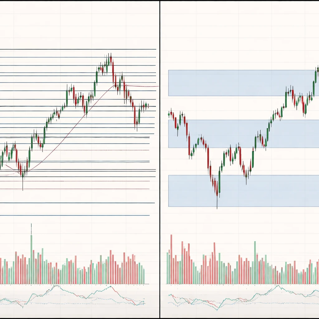
Support is commonly described as a price area where demand has exceeded supply, producing a tendency for declines to slow or reverse. Resistance is the mirror image, a price area where supply has exceeded demand. These areas may arise from clustered order placement, risk management thresholds, inventory adjustments by dealers, round number salience, or the memory of prior turning points. In a chart, they are often approximated by horizontal levels drawn near swings, gaps, or consolidation boundaries.
While the concept seems straightforward, operationalizing it involves choices. Annotations can be based on wick extremes or candle bodies, single prices or zones, linear or logarithmic scales, and a range of timeframes. Each choice introduces degrees of freedom. The more choices available, the greater the risk of fitting the past too closely.
Defining Overfitting Support and Resistance
In statistics, a model is overfit when it explains the historical sample extremely well but performs poorly out of sample. An overfit set of support and resistance lines behaves the same way. The chart is annotated in a way that explains nearly every historical swing with apparent precision. The precision is illusory because the lines are customized to the idiosyncrasies of the sample rather than to stable features of the market. Such lines often require many exceptions and adjustments. They change location or angle when new data appears, or they proliferate to accommodate every minor fluctuation.
Overfitting support and resistance can be recognized by the transition from a few interpretable reference areas to a dense lattice of lines. Explanatory power rises visually, but the underlying generalization capacity declines. The resulting framework can make any outcome seem consistent with the chart, which weakens interpretability.
How Overfitting Appears on Charts
Overfitting is a visual phenomenon. In practice it tends to appear as one or more of the following patterns:
- A crowded chart. Numerous horizontal or diagonal lines are drawn so that almost every past swing appears to respect a level by a small margin.
- Retroactive adjustments. A line is moved after each session to capture the latest wick or minor pivot, so the chart always looks aligned with history.
- Selective anchoring. Lines are anchored to outlier wicks while ignoring nearby levels that do not fit the narrative, producing a misleading sense of precision.
- Timeframe hopping. A level is justified on a 5-minute chart in one instance and on a weekly chart in another, depending entirely on what best fits the observed move.
- Excessive confluence. Multiple indicators or trendlines are layered to create clusters that appear meaningful only because of the sheer number of overlays.
- Hairline levels. Single prices are treated as if they were exact turning points, with no tolerance for typical volatility around them.
These features do not prove overfitting on their own, but they signal a growing likelihood that the chart prioritizes retrospective explanation over robust structure.
Why Traders Pay Attention to the Concept
Market participants monitor support and resistance because these areas can reflect collective behavior. When prices revisit a previously active zone, latent orders or risk controls may be triggered. The market often reveals memory in this way. The value of highlighting overfitting lies in its explanatory restraint. It reminds the observer that not every touch or minor pause indicates a meaningful level. Recognizing overfitting improves interpretation by separating structural features from coincidental alignments.
Understanding overfitting also clarifies the gap between apparent and actual precision. Markets evolve across regimes, liquidity conditions, and volatility levels. A level that fit well during one regime may not generalize to the next. Awareness of this fragility prevents overreliance on annotations that merely echo the recent past.
Statistical and Behavioral Underpinnings
Overfitting support and resistance has parallels with several statistical and behavioral phenomena:
- Multiple comparisons. Drawing many lines across many timeframes increases the chance that some will appear accurate by coincidence.
- Degrees of freedom. Choices about scale, anchors, and whether to use bodies or wicks all introduce flexibility. Flexibility makes it easier to fit noise.
- Hindsight bias. After a move has occurred, it is straightforward to find a level that seems to have predicted it. The interpretive challenge is to differentiate before-the-fact criteria from after-the-fact explanation.
- Apophenia. The human mind is adept at finding patterns, even in random data. Visual chart analysis can amplify this tendency.
- Anchoring and confirmation. Once a level is drawn, new evidence is filtered through it. Touches that agree with the level are emphasized while counterexamples are downplayed.
These forces do not invalidate technical analysis. Rather, they invite a more disciplined interpretation of what chart levels represent and how stable those representations may be.
Practical Chart-Based Context
Consider a hypothetical daily chart of a stock that traded between 45 and 70 over six months. Price paused three times near 60 before declining. On a clean chart, one might draw a broad resistance zone centered near 60 to reflect repeated selling interest. On an overfit chart, several lines are drawn: 59.80, 60.05, 60.20, 60.35, and 60.50. Each line is justified by a different wick or intraday pivot. In hindsight, price appears to have respected many precise boundaries. In forward time, this cluster offers little additional information beyond what a single zone already conveyed. Any future test is likely to interact with some of the lines simply because they are numerous, not because each is substantively meaningful.
A second illustration comes from an intraday futures chart during a volatile session. Suppose the average true range on a 5-minute basis is 1.2 points. If the chart is annotated with one-point spaced lines derived from various short-term swings, price will appear to repeatedly touch and react at levels. Many of these touches occur because the level spacing is similar to the typical bar range. Apparent precision is thus produced by volatility scale, not by structural supply or demand. Distinguishing volatility-driven interactions from meaningful reactions helps clarify why a level seemed to work.
Finally, imagine a growth stock charted on a linear scale during a multi-year uptrend. A trendline drawn through early lows looks clean. When price accelerates exponentially, a logarithmic scale becomes more appropriate. If the observer keeps the linear scale and repeatedly adjusts the trendline to pass through each new low, the chart will continue to look explanatory. The fit, however, relies on moving the line rather than on stable structure. This is a form of overfitting created by inconsistent scaling.
From Levels to Zones: Tolerance and Market Microstructure
Real markets rarely pivot at a single price. Liquidity is dispersed across ranges, and order books show depth that varies with time and venue. A practical implication for interpretation is that support and resistance often behave as zones with tolerances that reflect volatility and liquidity. Overfitting occurs when the annotation ignores tolerance and insists on pinpoint accuracy. Such a chart may treat a 0.3 percent deviation as a failure of the level, even when the deviation is smaller than a typical intraday fluctuation.
Understanding the zone-like nature of levels also clarifies why false breakouts or shakeouts can occur. If many participants cluster orders around a well-known price, short-term flows may push slightly beyond it before reversing. The overshoot does not always negate the underlying supply and demand dynamics. It may simply reflect the need for transactions to find liquidity in a finite order book. Overfitted charts tend to label these events as decisive invalidations, when they may be normal expressions of market microstructure.
Regimes, Volatility, and the Stability of Levels
Support and resistance are sensitive to regime shifts. In range-bound conditions with lower volatility, levels can appear stable and precise. In trending conditions with higher volatility, the same levels may be approached with greater speed and slippage. Overfitted annotations typically underestimate this variability. They extrapolate the precision observed in one regime to all others. When volatility expands, price traverses supposed levels too quickly for the annotations to retain their earlier meaning. The lines then require continual relocation, which further erodes generalization.
Considering regime effects helps explain why levels that seem strong in one period can degrade in another. It also underscores the value of consistency in how levels are defined. If the criteria change with each regime, even unintentionally, the chart will trend toward overfitting.
Event Anchors and Structural Context
Some price areas derive salience from events rather than from pure geometry. Earnings releases, macro announcements, index rebalances, or contract roll dates can alter liquidity and positioning. When a level is anchored to an economically meaningful event, it often exhibits persistence that differs from lines drawn solely to connect local extremes. This does not ensure predictive value, but it can provide a framework that is less sensitive to minor fluctuations.
Overfitting often appears when the event context is ignored and lines are repeatedly adjusted to match every swing. The chart thereby loses connection to the underlying reasons why participants might care about a price area. Without that connection, the annotations capture surface regularities that may not survive new information.
Diagnosing Overfitting in Chart Annotations
Several diagnostic ideas help identify when a set of support and resistance lines may be overfit, without prescribing tactics or making recommendations:
- Line proliferation. If each additional week of data requires new lines to preserve the chart’s explanatory power, the framework may be too flexible.
- Sensitivity to small changes. If shifting a line by a small increment dramatically changes the interpretation, the annotation likely captures noise.
- Timeframe inconsistency. If a level is drawn on one timeframe but does not leave any recognizable trace on adjacent timeframes, its stability is questionable.
- Look-ahead dependence. If the rationale for a level depends on future price action, the chart contains hindsight bias.
- Volatility mismatch. If the width of a level is much narrower than typical short-term volatility, exact touches are probably coincidental.
These diagnostics are not prescriptive. They encourage self-audit of the visual story told by a chart and help differentiate robust structure from retrospective fit.
Interpreting Price Behavior Through the Lens of Overfitting
Overfitting affects the interpretation of several common price behaviors:
- Breakouts and failures. If a chart contains many thin levels, any breakout will appear to fail quickly because price will meet another nearby line. The failure may be an artifact of the annotation density rather than an underlying change in supply and demand.
- Reversions near levels. When lines are numerous, price will often reverse near one of them simply by chance. This can create a selective memory of successful touches that overstates the relevance of each line.
- Pullbacks and retests. Clean pullbacks are easier to identify on uncluttered charts. Overfitted charts can transform a single pullback into multiple micro retests that appear meaningful but reflect ordinary bidding dynamics.
- Trendline breaks. Adjusted trendlines can always be drawn to preserve a trend. If a trendline is repeatedly redrawn to keep pace with higher highs or lower lows, the trendline’s informative value diminishes.
- Range identification. A range bounded by a top and bottom zone can be a useful descriptive frame. If the boundaries are repeatedly moved to accommodate whipsaw, the concept of a range loses utility.
Viewing these behaviors through an overfitting lens supports a modest stance toward precision. It also highlights the importance of volatility, liquidity, and regime context when interpreting interactions with levels.
Zones, Clusters, and the Role of Volume
Prices often respect clusters rather than single prices. Clusters can be identified visually by repeated reactions within a band, by volume profiles that reveal traded concentration, or by visible balance areas. Overfitting can occur when a cluster is decomposed into many micro levels that appear predictive individually. In reality, the cluster behaves as a composite area where a range of participants interacted. Treating such areas as zones accommodates minor overshoots and undershoots that are common in continuous trading.
Volume does not immunize against overfitting. For example, a visible node on a volume profile may be one of many nodes created by an arbitrary bin size. If the profile resolution is tuned repeatedly until it matches recent turning points, the analysis inherits the same multiple comparisons problem as line drawing. The guiding theme remains the same. Flexibility increases the risk of fitting noise while reducing the ability to generalize.
Common Pitfalls and Visual Illusions
Overfitting support and resistance is reinforced by several recurring pitfalls:
- Phantom confluence. When many tools are overlaid, intersections are inevitable. The resulting confluence can appear meaningful even if each component was tuned after the fact.
- Survivorship of clean examples. Charts that fit levels precisely are more likely to be saved and shared. Messier examples, where levels had little relevance, are forgotten, creating an inflated perception of precision.
- Scale illusions. Switching between linear and logarithmic scales can change the apparent path of price. Overfitting occurs when the scale is changed selectively to preserve a narrative.
- Wick obsession. Wick extremes are informative during fast markets, but they may reflect transient liquidity gaps. Treating each wick as a structural level tends to overfit to microstructure noise.
- Drift in annotations. As more data arrives, the original rationale for a level can be displaced. If the annotation is reinterpreted frequently, it may be serving the chartist’s story more than the market’s behavior.
Documentation and Replicability
Overfitting thrives in environments where criteria are ambiguous or adjusted frequently. Clear documentation of how a level was defined reduces ambiguity. For instance, recording whether the line references candle bodies or wicks, which timeframe anchored the level, and why that timeframe was chosen, all support interpretive consistency. Replicability matters. If an independent observer cannot reproduce an annotation from the same data using the same rules, the annotation was likely dependent on hidden degrees of freedom.
Timestamped chart snapshots can also clarify whether a level was identified before or after a move occurred. That distinction reduces hindsight bias. The goal is not to eliminate subjectivity entirely. It is to prevent subjectivity from expanding until any price path looks consistent with the chart.
What Overfitting Teaches About Market Behavior
Recognizing overfitting reframes support and resistance as probabilistic, context dependent, and regime sensitive. Levels can matter because market participants care about them, but price is free to deviate by amounts that reflect volatility and liquidity conditions. The relationship is not mechanical. A level may act as support several times and then cease to matter when positioning shifts, liquidity changes, or information arrives. Overfitting obscures these dynamics by creating an appearance of invariance that rarely exists.
A careful reading of charts respects both structure and uncertainty. Structure is visible in repeated reactions across time, event-linked anchors, and zones that align with observable liquidity. Uncertainty is visible in tolerance bands, volatility-driven overshoots, and the possibility that a previously active area will lose relevance. Overfitting compresses uncertainty into crisp lines that look authoritative but are brittle in practice. Understanding this tendency improves the interpretive quality of technical analysis without implying certainty or advocating specific decisions.
Closing Perspective
Support and resistance remain useful descriptive tools when they are treated as approximations that must withstand new data without constant revision. Overfitting is the opposite. It multiplies lines, moves anchors, and explains the past so perfectly that it says little about the future. A measured approach seeks clarity over precision, zones over hairlines, and documented criteria over shifting narratives. Such an approach accepts that markets evolve and that any annotation is a hypothesis about crowd behavior, not a statement of fact.
Key Takeaways
- Overfitting support and resistance occurs when chart annotations are tailored so closely to historical prices that they capture noise rather than persistent structure.
- On charts, overfitting often appears as dense line clusters, retroactive adjustments, selective anchoring, and excessive confluence across tools and timeframes.
- Understanding overfitting sharpens interpretation by distinguishing probabilistic zones from hairline levels and by emphasizing tolerance consistent with volatility.
- Statistical and behavioral forces, including multiple comparisons and hindsight bias, make precise-looking charts deceptively persuasive.
- Documented, consistent criteria for levels reduce ambiguity and help maintain generalization across regimes without implying certainty.