Introduction
Candlestick charts compress a period of trading into four essential data points: open, high, low, and close. By arranging these periods sequentially, a chart creates a visual narrative of price discovery. Within this narrative, the distinction between bullish and bearish candles offers a compact summary of which side gained or lost ground during a given interval. This article defines bullish and bearish candles, explains how they appear on charts, and discusses what they communicate about the balance of buying and selling pressure. The discussion remains descriptive and avoids trading strategies or recommendations.
Candlestick Basics: What a Single Candle Encodes
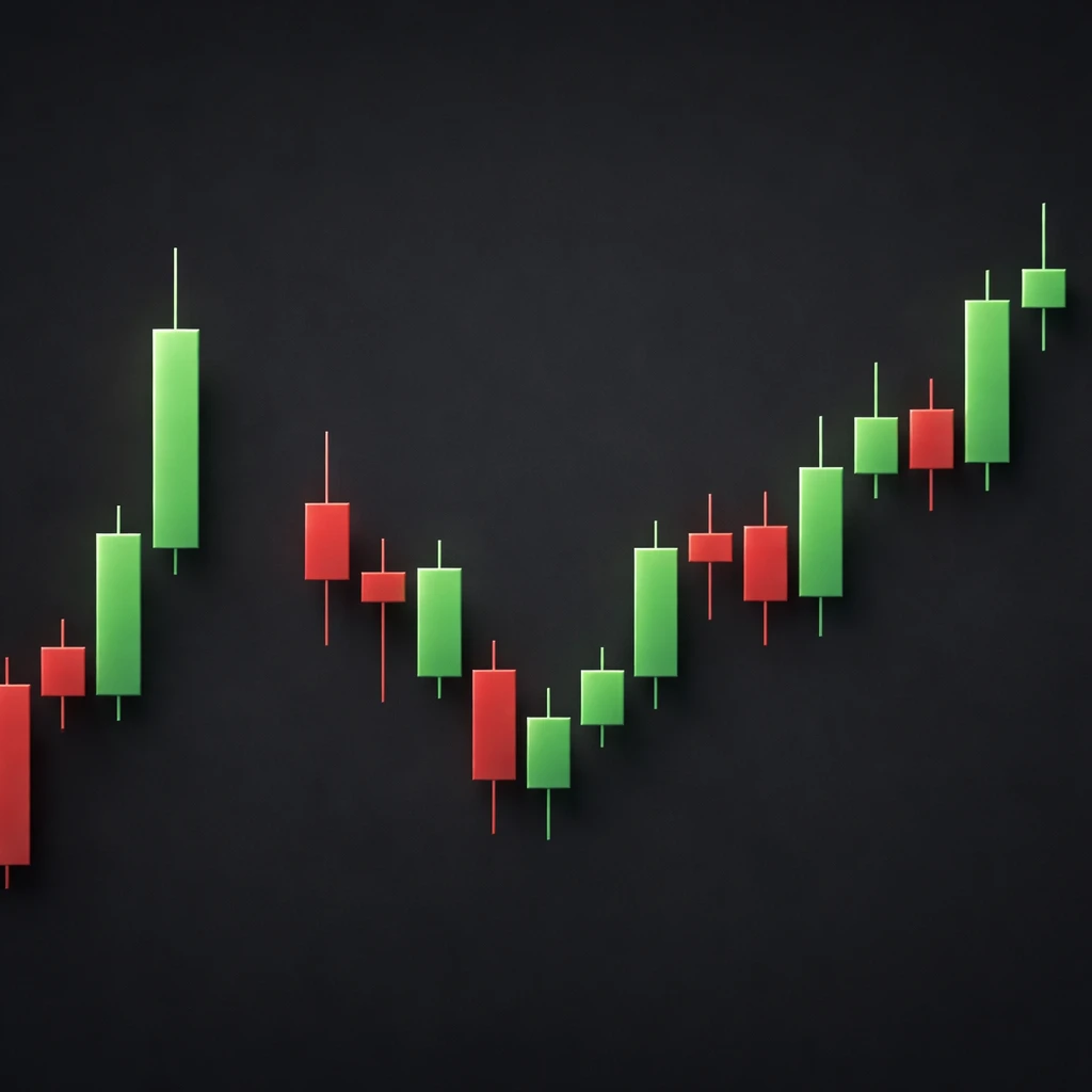
Each candlestick captures the market’s auction over a defined time window. A candle is built from four values: the opening price at the start of the interval, the highest price traded during the interval, the lowest price traded, and the closing price at the end. The candle’s rectangular body spans between open and close. Thin lines above and below the body, often called shadows or wicks, extend to the high and low. Color conventionally distinguishes whether the close finished above or below the open.
Two cases organize most of candlestick interpretation:
- Bullish candle: The close is higher than the open. Many charting platforms display bullish candles in green or white.
- Bearish candle: The close is lower than the open. Many charting platforms display bearish candles in red or black.
These colors are conventions. The underlying definition rests on the relationship between open and close, not on the chart palette. If the close equals the open, the body collapses into a very thin line, often labeled a doji. A doji is neither bullish nor bearish by close-minus-open definition and is typically treated as neutral for that period.
Why the Distinction Matters
A bullish candle communicates that buyers were able to advance price between the open and close of the interval. A bearish candle communicates that sellers pushed price lower relative to the open. While this statement appears simple, the information becomes more nuanced when considering the body size, the shadows, and the candle’s location within a broader context. Together, these details help describe intraperiod pressure, test levels, rejections, and continuity across time.
Traders observe the distribution of bullish and bearish candles across a chart to build a narrative about momentum and participation. Long sequences of bullish bodies suggest that successive intervals ended with buyers in control. Long sequences of bearish bodies suggest the opposite. The presence and length of shadows refine this picture by indicating how far price probed away from the open-close zone and whether those probes were accepted or rejected before the close.
How Bullish and Bearish Candles Appear on Charts
On most platforms, a bullish candle is drawn with the body colored in green or left unfilled to emphasize a close above the open. A bearish candle is drawn with the body colored in red or filled to emphasize a close below the open. The upper shadow extends from the higher of the open or close to the high of the session. The lower shadow extends from the lower of the open or close to the low.
Several visual details help with interpretation:
- Body length: A larger body indicates a bigger difference between the open and close. All else equal, large bullish bodies are often associated with strong buying pressure during that period, and large bearish bodies with strong selling pressure.
- Shadow length: Long upper shadows show that price traded significantly above the body but retreated before the close. Long lower shadows show that price traded significantly below the body but rebounded before the close.
- Range: The total high-low distance suggests the period’s volatility, regardless of whether the close finished above or below the open.
- Gaps (where applicable): In markets that open and close daily, the candle may start the session above or below the prior close, producing a visual gap. A bullish candle that begins with a gap up may reflect overnight repricing, while a bearish candle after a gap down may reflect overnight deterioration in sentiment or information.
Formal Definitions and Simple Measurements
Although charts are visual, simple arithmetic clarifies what the shapes signify. Let O, H, L, C denote the open, high, low, and close for a candle. Then:
- Body length: absolute value of C minus O.
- Upper shadow: H minus the maximum of O and C.
- Lower shadow: the minimum of O and C minus L.
- Total range: H minus L.
- Body-to-range ratio: body length divided by total range, a rough indicator of how much of the period’s exploration was retained into the close.
These quantities are descriptive. They do not prescribe future moves. A candle with a high body-to-range ratio reflects a close near the extreme of its range, which is often read as strong intraperiod conviction. A candle with long shadows and a small body reflects substantial back-and-forth that largely netted out by the close.
Interpreting Bullish Candles
A bullish candle indicates a close above the open. Beyond that binary classification, interpretation hinges on proportion and context:
Large-body bullish candles: A tall body with relatively small shadows suggests persistent buying throughout the period. If the close is near the high, the upper shadow is short or absent, sometimes labeled a marubozu. A bullish marubozu indicates price advanced and finished near its best level for the session. Such candles often appear during strong momentum phases or after new information triggers aggressive repricing.
Bullish candles with long lower shadows: These form when price traded meaningfully lower during the period but was met by demand that lifted the close above the open. The presence of the lower shadow indicates that sellers were active, but that buyers were sufficiently engaged to overcome those attempts by the close.
Small-body bullish candles: When the body is small relative to the range, much of the period’s move occurred within the shadows. This may reflect intraperiod indecision or two-sided trade that resolved only marginally in favor of buyers.
Interpreting Bearish Candles
A bearish candle indicates a close below the open. As with bullish candles, nuance arises from structure and context:
Large-body bearish candles: A tall body with small shadows suggests persistent selling through the period. Closing near the low implies sellers maintained control into the end of the session.
Bearish candles with long upper shadows: These reflect attempts to rally that failed. Price traded higher during the period, met supply or profit taking, and finished back below the open.
Small-body bearish candles: A narrow body signals that the net result was a modest decline relative to the back-and-forth inside the range. The period showed activity, but neither side finished with decisive control.
Context: Time Frame, Trend, and Volatility
Interpretation of bullish and bearish candles always depends on context. The same candle shape can mean different things on a 1-minute chart compared with a daily or weekly chart. It also depends on where the candle appears relative to recent trend and volatility.
Time frame: A 5-minute bullish candle inside a broader daily down day often reflects local counter-move rather than a shift in the higher-level path. Conversely, a strong weekly bearish candle has implications over a longer horizon than a single intraday bar.
Trend phase: In an existing uptrend, a sequence of bullish bodies is common and not necessarily informative by itself. Additional emphasis is placed on changes in character, such as decreasing body size, expanding upper shadows, or a sudden large bearish candle. In a downtrend, the inverse logic applies.
Volatility regime: Candle size must be evaluated relative to typical size for the instrument and time frame. A 1 percent range may be large for a stable large-cap stock but trivial for a small-cap or a volatile cryptocurrency. Average True Range or a simple moving average of recent ranges can help establish what qualifies as large or small in context.
Gaps and Session Structure
In markets with discrete sessions, opening gaps change how candles communicate information. A bullish candle following a gap up might capture follow-through buying after new information, while a bearish candle that fades below the open after a gap up could reflect early enthusiasm that did not hold. Overnight sessions, pre-market, and post-market trading can also produce irregular candles due to lower liquidity and wider spreads. These conditions sometimes generate long wicks that reflect price discovery under thinner participation.
By contrast, continuous markets such as many foreign exchange pairs do not exhibit the same pattern of daily gaps. In those markets, the emphasis often shifts more heavily to intraperiod range and the relationship between wicks and bodies.
Examples in Practice
Example 1: Daily Equities Chart After a Quiet Consolidation
Suppose a stock trades in a narrow consolidation for several weeks, with alternating small bullish and bearish candles and short shadows. On day one of a new phase, a large bullish candle forms with the close near the high, and volume is higher than the prior week’s average. The body is substantially larger than recent bodies, and both shadows are short. The visual message is that buyers exerted steady control throughout the session and that the session ended near the day’s best price.
Day two prints another bullish candle, still larger than the prior consolidation period but smaller than day one. A small upper wick appears as price approached a prior swing high on the chart. This suggests initial enthusiasm carried forward but met some supply near historical levels. Day three shows a smaller bullish body and a more notable upper shadow, indicating that attempts to extend upward met increasing counterflow. The sequence conveys a transition from decisive buying to a more balanced auction as price reached a reference area.
Nothing in this sequence prescribes subsequent movement, yet the candles provide information about how participation evolved. Early dominance by buyers gave way to two-sided interaction as the market revisited an area where selling interest previously emerged.
Example 2: Intraday Futures at a Prior Resistance Level
Consider a 5-minute chart of an index future approaching a region that previously capped advances. A series of bullish candles escalates toward that zone, with bodies growing larger and lower shadows shrinking. As price touches the level, the next candle shows a long upper shadow and a small body that closes slightly above the open. The following candle is bearish with a sizable body and a close below the midpoint of the prior candle’s range.
Across these three bars, the chart shows strong buying, tests into supply, and then a response that pushed price away from the tested zone. The first candle’s body-to-range ratio is high and consistent with directional pressure. The doji-like candle with a long upper shadow shows strong probing that did not hold. The subsequent bearish candle indicates that sellers were able to push price below where it recently found buyers.
The sequence does not predict the next hour of trade, but it does clarify that the resistance region attracted meaningful two-sided interest and that sellers were able to assert control for at least several minutes.
Example 3: Currency Pair Around a Scheduled News Release
Foreign exchange often trades continuously and with deep liquidity, yet liquidity can still fragment around announcements. Assume a currency pair prints a narrow series of alternating small bodies ahead of a scheduled economic release. At the time of the release, a wide-range candle forms. Price first spikes down, creating a long lower shadow, then reverses and closes above the open, producing a bullish body. The upper shadow is also long.
This candle communicates extreme intraperiod volatility, two-sided probing, and a close that ended marginally in favor of buyers. Spreads and execution quality may have influenced the extremes, and algorithms reacting to the data likely contributed to rapid swings. The presence of long shadows on both sides warns that much of the exploration occurred away from the close, which reduces the informational value of the close alone.
Special Candle Types and Their Relevance to Bullish vs Bearish
Some candle types are commonly referenced in chart analysis. The classification as bullish or bearish still depends on close relative to open, but the structural features matter:
Marubozu: A candle with no or minimal shadows, implying a close at or very near the period’s extreme. A bullish marubozu is a strong close near the high. A bearish marubozu is a strong close near the low.
Doji: A candle where open and close are the same or very close. The label indicates neutrality for that period. Doji candles can still have long shadows, reflecting active exploration that netted out by the close.
Spinning top: A small body centered within relatively symmetric shadows. This appearance typically conveys balance or indecision during the period.
Engulfing range: Two consecutive candles where the second candle’s high-low range exceeds the first candle’s entire range. If the second candle closes above the first and covers the entire range, it is often discussed as a bullish engulfing pattern. If it closes below, as a bearish engulfing pattern. The information content lies in the expansion of range and the closing location relative to that expansion.
These labels are shorthand for specific structures. They are not trading signals in isolation but can help one describe the character of price action across periods.
Sequencing and Transitions
Much of candlestick interpretation arises from how candles evolve through time rather than any single bar. A few recurring transitions are educational:
From expansion to contraction: After one or several large-body candles, subsequent smaller bodies and longer shadows often mark a shift from directional aggression to balance.
From contraction to expansion: After a stretch of small candles, a sudden large bullish or bearish body signifies a return of imbalance. Whether this imbalance persists or fails requires further observation.
Climactic candles: Very large ranges relative to recent history sometimes appear near the end of extended moves. These can feature long shadows as price probes beyond recent extremes and then reverses before the close. The label “climactic” is descriptive and does not presuppose a reversal.
Volume and Participation
Volume is not part of the candle itself but often displayed below prices as a histogram. When available and reliable, it can contextualize a candle’s significance. A large bullish body on unusually high volume suggests that many units changed hands during the advance. A large bearish body on low volume suggests the decline occurred with fewer transactions, which might reflect thin participation. Different markets handle volume differently. Some foreign exchange charts display tick volume rather than centralized exchange volume, while equities and futures provide exchange-reported figures.
Volume does not validate or invalidate a candle, but it often refines how one reads commitment and participation behind the move. The same body size can carry different weight depending on whether it occurred alongside elevated or muted traded volume.
Common Misinterpretations and Limitations
Color preferences can mislead: Because platforms allow custom color schemes, associating green with good and red with bad is an oversimplification. Focus on the numerical relationship between open and close, plus the high-low range.
Time frame conflicts: A trader observing a 1-minute series of bullish candles inside a bearish hourly trend may infer contradictory narratives. Aligning interpretation with the intended time horizon is essential to avoid reading noise as meaningful change.
Ignoring average size: Declaring a candle “large” without reference to typical size invites error. Relative measures such as comparing the body or range to a moving average of recent candles help maintain proportionality.
Assuming predictability: A single bullish or bearish candle does not guarantee follow-through. It only states where the market closed relative to where it opened, plus the exploration it undertook in between.
Session artifacts: Overnight gaps, holiday sessions, and thin liquidity periods can produce candles that overstate conviction. Long wicks during off-hours may reflect sparse order books rather than robust rejection.
Relating Candles to Market Microstructure
Candlesticks can be read as a consequence of order flow. A bullish body indicates that trades occurred at progressively higher prices through the session, culminating in a close above the open. A bearish body reflects the opposite. Shadows capture excursions where limit orders absorbed market orders and halted a push, or where liquidity thinned and price had to travel further to locate counterparties. This framing aligns candlestick interpretation with the notion that price moves to find liquidity and value, not to fulfill deterministic patterns.
In liquid conditions, large bodies with shallow shadows often coincide with efficient directional trade. In thin or fragmented conditions, long shadows and erratic bodies are more common as price jumps between pockets of liquidity. Recognizing which environment one is viewing helps calibrate how much weight to give the candle’s message.
Statistical Examination of Candles
Many analysts record basic statistics on candle structure to better understand an instrument’s behavior over time. Examples include:
- Average body length over a rolling window for a chosen time frame.
- Average range and its variability, sometimes summarized by standard deviation.
- Distribution of body-to-range ratios.
- Frequency of long-shadow candles above a chosen percentile threshold.
- Proportion of bullish to bearish closes within a session, week, or month.
These summaries are descriptive. They can highlight shifts in volatility or participation and reveal whether the market is spending more time closing near extremes or reverting toward mid-range by the close.
Comparisons Across Markets
Equities: Daily candles often reflect information releases clustered around earnings or macroeconomic dates. Gaps are common, and the relationship between the gap and the intraday candle can be important to the session’s narrative.
Futures: Many contracts trade nearly around the clock, but liquidity concentrates in pit or main electronic hours. Candles printed during thin overnight sessions can exhibit long wicks and irregular bodies.
Foreign exchange: Continuous trading reduces daily gaps, and the daily candle often aggregates many regional sessions. Intraday candles can vary substantially during the transition between Asia, Europe, and North America, as liquidity and participation shift.
Cryptoassets: Continuous trading with varying liquidity across venues may produce candles with idiosyncratic wicks. Exchange-specific conditions can matter because there is no single consolidated tape.
From Single Candles to Narrative Building
A single bullish or bearish candle offers a snapshot. A sequence offers a storyline. Analysts often integrate multi-candle information to describe whether a market displays continuation, hesitation, or reversal behavior. For example, a series of higher closes with growing bodies depicts strengthening momentum. A series of small alternating bodies inside a narrow range depicts balance or compression. A sudden expansion candle after compression depicts a fresh imbalance.
None of these descriptions prescribe a course of action. They function as a language to describe price behavior. This language becomes more useful when combined with other structural cues such as volatility regime, proximity to prior swing highs or lows, and participation levels indicated by volume or order book depth where available.
Practical Notes for Reading Charts
- Verify the time frame and instrument before drawing inferences. A candle’s significance changes with horizon.
- Check scale and session boundaries. Hidden pre-market or after-hours data can alter the apparent structure of the first or last candle of the day.
- Compare candle size with recent history. Relative assessment grounds interpretation in context.
- Note whether outlier candles correspond to scheduled events. Event-driven candles often display larger ranges and longer shadows.
- Be cautious about generalizing from a single bar. Sequences and transitions carry more information than isolated moments.
Concluding Perspective
Bullish and bearish candles reduce a complex auction into recognizable shapes that summarize who controlled the close and how far price explored to get there. Body, shadow, and range are objective facts about the period. Their significance arises from proportion and placement within a larger structure of trend, volatility, and session context. Interpreting these details helps articulate what the market has done, without implying what it must do next.
Key Takeaways
- A bullish candle closes above its open, and a bearish candle closes below; color is a convention, not a definition.
- Body size, shadow length, and total range refine the message about intraperiod pressure and rejection.
- Context matters: time frame, volatility regime, gaps, and location relative to recent structure shape interpretation.
- Sequences of candles convey evolving balance or imbalance more reliably than isolated candles.
- Candlestick information is descriptive of price action and does not predict outcomes or prescribe trades.