Introduction
Technical indicators and oscillators can clarify aspects of market behavior that raw prices do not reveal at a glance. They summarize movement, smooth noise, and translate price and volume into momentum, trend, and volatility measures. Yet the same tools can obscure the signal when they are layered without discipline. The Too Many Indicators Problem refers to the loss of clarity and reliability that occurs when a chart becomes crowded with numerous indicators, many of which convey overlapping or contradictory information. The result is not simply visual clutter. It is a structural problem of redundancy, inconsistent time horizons, and heightened cognitive load that compromises interpretation of price behavior.
The concept matters because price is the common input for most technical tools. When several transforms of the same data are displayed simultaneously, their messages may diverge for mechanical reasons unrelated to the underlying market. Reading that divergence as meaningful can mislead analysis. Understanding why this happens helps maintain a coherent link between what indicators measure and what price is actually doing.
What Counts as an Indicator or Oscillator
An indicator is any rule-based transform of market data. Typical inputs include price, volume, and sometimes derived series such as true range. Indicators can be grouped into families by what they aim to summarize:
- Trend measures: moving averages, moving average envelopes, and similar smoothers.
- Momentum oscillators: RSI, stochastic oscillators, MACD histogram, rate of change.
- Volatility gauges: Bollinger Bands, Average True Range, historical volatility.
- Volume-derived transforms: On-Balance Volume, Money Flow Index, volume-weighted average price bands.
Each family addresses a distinct question. Trend tools ask whether price is drifting up or down over a chosen window. Momentum asks how quickly it is changing. Volatility asks how widely price has been dispersing. Volume tools ask whether activity is expanding or contracting and how flows relate to price changes. The Too Many Indicators Problem often emerges when several tools attempt to answer the same question in slightly different ways at the same time.
Defining the Too Many Indicators Problem
The Too Many Indicators Problem is the analytical degradation that results from excessive or poorly coordinated use of technical indicators on a single chart or across a set of charts. It has three core dimensions:
- Redundancy: indicators based on similar mathematics or lookback windows deliver highly correlated signals, creating an illusion of confirmation.
- Inconsistency of horizons: mixing fast and slow settings causes mechanical disagreement that reflects parameter choices rather than genuine market conflict.
- Cognitive overload: excessive visual elements compete for attention, increase ambiguity, and invite selective perception.
Importantly, the problem is not solved by choosing a particular named tool. It is addressed by aligning each indicator with a clear analytical role, minimizing overlap, and keeping time horizons consistent with the questions being asked of the data.
How the Problem Appears on Charts
Several recognizable symptoms tend to appear when too many indicators crowd a chart:
- Overdrawn price pane: price bars or candles are hidden beneath three or more moving averages, volatility bands, and colored zones that mask the underlying action.
- Stacked subpanels: multiple oscillators in separate panes show frequent crosses and divergences that constantly disagree with one another.
- Indicator whipsaw discord: a fast oscillator signals overbought while a slow oscillator climbs from mid-range, and a trend filter remains positive. The conflict owes more to window length than to market structure.
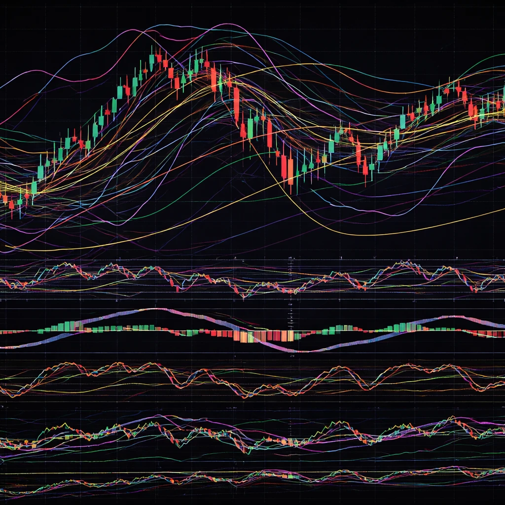
- Heatmap aesthetic: the chart visually resembles a dashboard with many colored lights. The sheer number of cues makes it hard to form a coherent narrative anchored in price.
- Serial justification: after a move, one can always point to one indicator that happened to align with the outcome. This fosters hindsight rationalization rather than forward-looking interpretation.
These symptoms reflect the underlying mechanics. Indicators transform the same data differently. When too many transforms are layered, they are guaranteed to disagree often, not because the market is uniquely indecisive, but because the transforms encode different lags and sensitivities.
Why Traders Pay Attention to the Concept
Analysts care about the Too Many Indicators Problem because it changes how one extracts information from price:
- Signal dilution: adding more transforms generally increases the number of crossing events and threshold hits. The base rate of signals grows faster than the rate of genuinely informative ones.
- False precision: a chart packed with quantitative overlays can feel more exact, yet the aggregate information content may not increase. Confidence can rise while accuracy does not.
- Confirmation bias: with many tools available, it is easy to cherry-pick whichever indicator aligns with a desired narrative in the moment.
- Timeframe confusion: when indicators reference different lookbacks, the chart mixes signals about short-term fluctuations with those about longer-term drift. This conflation blurs the interpretation of price behavior.
By recognizing these effects, analysts can attribute certain disagreements to method rather than market, and focus attention on the price relationships that truly changed.
Redundancy and Overlap Across Indicator Families
Many indicators are mathematically related. A few examples illustrate common overlaps:
- Moving average variations: simple, exponential, and weighted moving averages are all smoothers. A 20-period simple moving average and a 21-period exponential moving average might look different but will often track in parallel when price trends steadily. Overlaying several can create the visual illusion of robust confirmation when they are essentially measuring the same thing.
- Momentum cousins: RSI, stochastic oscillator, and rate of change all capture aspects of momentum. They differ in scaling and responsiveness, not in core purpose. When price accelerates, they will often rise together with minor differences in timing.
- Derivative chaining: MACD is derived from the difference of two moving averages, and its histogram is the difference of MACD and its signal line. Adding three panels of MACD variants creates layers of transforms of the same underlying smoother.
- Volatility bundles: Bollinger Bands and Average True Range both summarize range expansion. Bands widen when ATR rises. Using both can be educational, but the two will usually convey similar regime changes.
Understanding these relationships helps identify when a chart carries multiple versions of the same message. When several near-equivalent measures are displayed, their agreement is not independent corroboration. It is a restatement of one idea in different syntax.
Lag, Smoothing, and Time Horizon Conflicts
All smoothing introduces lag. A long moving average will always respond more slowly than a short one. Oscillators incorporate smoothing in their calculations as well. When a chart combines fast and slow transforms without a clear reason, indicator disagreement is baked in. For example, during a rapid upswing:
- A short-term oscillator may enter overbought territory quickly.
- A medium-term trend measure may still be turning up from a recent consolidation.
- A long-term average can remain flat for several sessions before reflecting the change.
If one interprets the oscillator as a warning and the average as confirmation of trend health, the chart ends up sending two conflicted messages at once. The disagreement traces to different windows, not necessarily to a complex narrative inside the market. Clarity improves when each tool’s time horizon is understood and aligned with the specific aspect of price one intends to observe.
How the Concept Shows Up in Price Interpretation
The Too Many Indicators Problem makes analysts focus on indicator states rather than on price structure. For instance, a sequence of higher lows on the chart may be more informative about underlying demand than the exact level of three oscillators. However, when the chart displays many panels, it is natural for attention to gravitate toward the most recent cross or threshold breach. The analyst may then explain price moves using those events, even when the same outcome could have been inferred from price alone. The abundance of cues reduces the relative weight given to the primary data.
Conversely, minimal but well-chosen tools can help interpret common price behaviors without overburdening the chart. A single trend measure can make the slope of the market more legible. One volatility measure can indicate whether ranges are contracting or expanding. An oscillator can suggest when momentum is accelerating or fading. The aim is not to advocate a specific combination. It is to show that each tool should correspond to a distinct analytical purpose. When that mapping is absent, indicator count tends to expand and clarity declines.
Practical Chart-Based Context: A Daily Equity Example
Consider a daily chart of a liquid equity during a three-month advance punctuated by pullbacks of 3 to 5 percent. Suppose the chart contains price candles with 20, 50, and 200-day moving averages, Bollinger Bands, RSI, stochastic oscillator, and MACD histogram. During a routine two-week pullback, several events occur:
- Price dips from the upper to the middle Bollinger Band as volatility expands slightly.
- RSI falls from 65 to 45 while the stochastic oscillator crosses below 50 then whipsaws back above within a few sessions.
- MACD histogram turns negative as the fast average slips under the slow average.
- The 20-day moving average flattens, the 50-day remains upward sloping, and the 200-day is far below price.
This cluster of signals can be read in many ways. One interpretation is that momentum is deteriorating, volatility is picking up, and trend strength is in question. Another interpretation is that short-term momentum has cooled while the intermediate trend remains intact. The two readings flow from different horizons embedded in the indicators. Without a clear sense of which horizon is under examination, the chart seems internally conflicted because it includes many tools summarizing different segments of the same move.
Now imagine removing several overlapping elements in order to focus on what each remaining tool contributes to understanding price. The candles show whether the sequence of highs and lows remains constructive or has changed character. A single trend measure clarifies whether the slope has meaningfully shifted. One oscillator can contextualize the speed of the pullback relative to recent rallies. The goal of this contrast is educational: it shows how too many layers can obscure the straightforward behaviors the market is exhibiting.
Practical Chart-Based Context: An Intraday Futures Example
Shift to a five-minute futures chart during a volatile session around a macro announcement. The display includes VWAP with standard deviation bands, volume profile at price, On-Balance Volume, Money Flow Index, RSI, and MACD, plus an Average True Range line for each bar. Price snaps sharply in both directions over the first hour.
- VWAP bands expand as volatility rises and price oscillates around the anchor.
- OBV posts an early climb but flattens as two large counter-moves appear.
- MFI tracks RSI higher and lower in close alignment, both reacting to the same impulse swings.
- MACD prints several zero-line crosses in quick succession as direction flips.
The chart radiates activity. Yet most of the tools convey overlapping information about momentum changes driven by the same event. The indicators are not malfunctioning. They are transcribing the same turbulence with different lags and scales. Reading deep meaning into each cross or band touch risks mistaking the mechanics of transforms for the structure of the market. In this context, fewer, non-redundant measures can make it easier to distinguish directional intent from noise and to see when volatility rather than trend is the defining condition of the session.
Families of Information and What They Say About Price
Organizing indicators by the market attribute they summarize can help maintain interpretive clarity. Consider how each family maps to observable behavior:
- Price structure: swings, ranges, and breakouts are visible directly on the chart. Indicators should complement, not replace, the reading of highs, lows, and ranges.
- Trend strength: slope and persistence reflect whether directional movement is sustained. A smoother highlights the drift but mutes inflection points by design.
- Momentum: rate of change captures acceleration and deceleration. Oscillators are sensitive to quick shifts and may lead or lag depending on settings.
- Volatility regime: range width fluctuates across regimes. Bands and ATR help frame how far price commonly travels per unit time.
- Participation and flow: volume and its transforms provide context for whether moves occur on expanding activity.
When multiple tools within a family are used at once, the chart often adds redundancy rather than new information. A single, well-understood representative from each relevant family generally conveys the essential contour of price behavior for the chosen horizon. The central point is conceptual economy. Each tool needs a question to answer. Unassigned tools multiply on the screen and crowd out the primary evidence.
Where Cognitive Bias Meets Chart Mechanics
The Too Many Indicators Problem is intensified by predictable human tendencies:
- Attentional capture: brightly colored lines and frequent crossing events draw the eye, regardless of their incremental information value.
- Availability bias: the indicator that fired most recently is often weighed more heavily than slower, context-setting measures.
- Hindsight comfort: after a move, it is easy to find at least one indicator that appeared to warn of it. This can motivate adding even more tools to avoid missing the next signal.
- Rule layering: each new tool arrives with rules and thresholds. The accumulation of rules can create a dense permission structure that few real-time price sequences will satisfy consistently.
Bias and mechanics interact. For example, a fast oscillator will produce many events in a choppy market. The frequency of those events can foster a sense that the chart is highly informative, while the underlying price may be trapped in a narrow range. Recognizing this interaction helps maintain a disciplined view of what information is genuinely additive.
Diagnosing the Problem on Your Own Charts
An audit of a chart layout can reveal whether the Too Many Indicators Problem is present. Typical diagnostic questions include:
- What specific question does each indicator answer about price, momentum, volatility, or participation?
- How many tools are measuring effectively the same attribute with similar windows?
- Are the lookback periods and sensitivities aligned with the time horizon of interest, or are long and short horizons mixed without intent?
- Could the main conclusion drawn from the chart be reached using price structure and a smaller set of tools?
- Does one frequently search across panels for a confirming signal after noticing a move in price, or is the analytical sequence defined in advance?
These questions do not prescribe a single correct configuration. They encourage transparency about what each element contributes and whether its contribution is unique enough to justify its presence.
Parameter Choice and the Illusion of Novelty
Changing parameters can make an indicator look new when it is not. A 10-period oscillator and a 14-period oscillator may be close substitutes in many contexts. Likewise, swapping a simple for an exponential moving average changes responsiveness, but both remain smoothers of similar class. If two tools produce signals that are strongly correlated over time, they function as one source of information. Agreement between them should not be treated as independent evidence.
One way to think about parameter choice is to relate it to the price structures one hopes to observe. If the question centers on swings lasting several weeks, a cluster of fast indicators will inevitably generate contrary cues. If the question centers on intraday bursts, slow tools will lag by design. Clarity improves when parameter choices mirror the price behavior under examination instead of competing with it.
Multiple Timeframes and Stack Effects
Analysts often examine several timeframes. The Too Many Indicators Problem arises here when each timeframe includes a full suite of tools. The visual and cognitive load multiplies, and the potential for mechanical disagreement grows. For example, a short-term oscillator on a five-minute chart can be falling while a daily trend measure rises. Both may be correct for their horizons, yet the mind tends to search for a single answer. Without a framework that assigns weight to each timeframe, the stack of indicators invites ad hoc narratives and reactive interpretation.
How the Concept Helps Interpret Market Price Behavior
Understanding the Too Many Indicators Problem refocuses analysis on the core relationship between price action and a small number of complementary summaries. Price behavior unfolds through sequences of swings, pauses, and expansions in range. Indicators add value when they highlight that structure without substituting for it. Recognizing redundancy, time-horizon mismatches, and cognitive load helps an analyst read the chart on its own terms.
Consider a breakout from a multi-week range. With a crowded chart, several oscillators may flag overbought on the first thrust, a pair of averages may remain flat, and a volatility band may be touched. The mixed signaling can provoke hesitation about the nature of the move. With a simpler chart, price breaking above the established boundary is immediately legible, a single trend measure can display whether slope changes are underway, and one volatility tool can show that range expansion has occurred. The market message is clearer, not because the tools predicted an outcome, but because they summarize the behavior that happened in a way that aligns with the question at hand.
Similarly, in a mean-reverting episode inside a larger trend, a crowded chart encourages attending to each cross and threshold event as a discrete call about direction. A streamlined chart makes it easier to see that the sequence represents a counter-move that either alters the structure or does not. This does not eliminate uncertainty. It reduces the portion of uncertainty that is self-created by indicator sprawl.
Common Misconceptions
Several misconceptions keep the Too Many Indicators Problem alive:
- More tools means more accuracy: in reality, more transforms of the same input often reduce clarity and inflate confidence without improving insight.
- Disagreement equals opportunity: oscillators disagree frequently because of parameter differences. Treating those disagreements as uniquely informative can be a category error.
- Removing indicators eliminates objectivity: fewer tools, chosen for distinct roles, can increase objectivity by making assumptions explicit and reducing scope for selective interpretation.
- Agreement across cousins is robust confirmation: when indicators are correlated, their alignment is not multiple independent votes. It is a chorus of similar voices.
Practical Considerations for Clearer Charts
Clarity does not require minimalism for its own sake. It requires coherence. A clear chart typically exhibits the following characteristics:
- Price is visible and legible. Overlays do not obscure candles or bars.
- Each added study has a defined role that is not already covered by another study on the screen.
- Lookback periods correspond to the timeframe under analysis rather than mixing fast and slow windows haphazardly.
- The analyst can articulate what a change in each indicator would imply about price behavior, and what it would not imply.
This perspective preserves the usefulness of technical tools while avoiding the pitfalls that come with indicator proliferation. It links indicator states to observable price structures rather than to a shifting collection of thresholds.
Educational Reflection: From Data to Interpretation
The Too Many Indicators Problem underscores a broader analytical principle. Summaries of data are most informative when they are few, well understood, and purpose-built for the question at hand. Price is already a summary of many participants’ decisions. Indicators add structure, but each addition narrows attention to a particular transformation. When many transforms compete, the interpreter’s attention fragments. Consolidating measurement around key dimensions of behavior helps maintain focus on the evolving narrative of the market rather than on the mechanics of the tools.
Key Takeaways
- The Too Many Indicators Problem arises when indicator proliferation introduces redundancy, mixed time horizons, and cognitive overload that obscure price behavior.
- Most indicators are transforms of the same inputs, so agreement across related tools often reflects overlap rather than independent confirmation.
- Disagreements between fast and slow tools frequently result from parameter differences, not from deep market conflict.
- Charts are clearest when each indicator serves a distinct role tied to an explicit question about price, momentum, volatility, or participation.
- Understanding this concept helps analysts interpret market moves with less self-imposed noise and a tighter link between indicators and the underlying price action.