The Moving Average Convergence Divergence, commonly known as MACD, is one of the most widely used technical indicators for interpreting price behavior. It blends two central ideas in technical analysis. The first is trend, captured by how short-term and longer-term prices compare. The second is momentum, reflected in how quickly that relationship changes. MACD was developed by Gerald Appel in the late 1970s and has remained popular because it presents these ideas in a compact, readable form beneath a price chart.
This article defines MACD precisely, describes how it appears on charts, explains why many analysts study it, and offers practical context for interpreting its movements. The focus is educational. No specific trades or strategies are suggested.
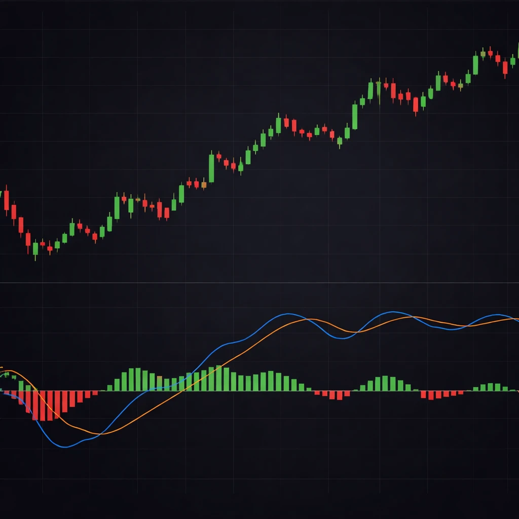
What MACD Measures
At its core, MACD measures the difference between two exponential moving averages of price. A moving average is a smoothed representation of recent prices. An exponential moving average, or EMA, places more weight on the most recent observations. MACD typically uses a short-term EMA and a longer-term EMA, then subtracts the longer from the shorter. When the short-term EMA is above the long-term EMA, the difference is positive. When the short-term EMA is below the long-term EMA, the difference is negative. That difference is the MACD line.
The usual default settings are 12 periods for the short EMA and 26 periods for the long EMA, using closing prices. These numbers were chosen historically for daily data and have become a convention. Many platforms allow customization. Regardless of the specific parameters, the basic interpretation remains the same. The MACD line summarizes the gap between faster and slower price averages, which in turn reflects the balance between short-term and longer-term price forces.
The Signal Line and Histogram
Two companion elements are plotted with the MACD line:
- Signal line. A smoothed version of the MACD line itself, usually a 9-period EMA of the MACD line. It acts as a reference for changes in the MACD line.
- Histogram. A bar plot of the difference between the MACD line and the signal line. When the MACD line is above the signal line, the histogram bars are positive. When it is below, they are negative. The height of the bars indicates how far apart the two lines are, which conveys the strength or weakness of momentum.
These three components make MACD a compact tool. The MACD line conveys directional bias between short and long averages. The signal line smooths that bias into a more stable curve. The histogram displays the acceleration or deceleration of that bias as the distance between the two lines grows or shrinks.
How MACD Appears on Charts
MACD is typically plotted in a separate panel beneath the price chart. The panel contains a horizontal zero line at the midpoint. The MACD line and the signal line oscillate around that zero line. The histogram bars extend above and below zero depending on whether the MACD line is above or below the signal line.
Several visual aspects are standard:
- Zero line. The horizontal midline represents where the short and long EMAs are equal. When the MACD line crosses zero, the short EMA crosses the long EMA on the price chart.
- Two lines. The MACD line often appears as a thicker or more prominent line, with the signal line plotted as a thinner smoothing curve. Colors vary by platform.
- Histogram bars. Bars are drawn vertically from the zero line. Positive bars appear above zero, negative bars below. Many platforms color bars differently when they increase or decrease in height to visually indicate changes in momentum.
MACD values are not bounded by fixed limits such as 0 to 100. The scale depends on price volatility and the instrument’s price level. A large, volatile asset can produce a wide MACD range, while a stable asset produces narrower oscillations. This unbounded property distinguishes MACD from bounded oscillators like RSI.
Calculation Details and Conventions
In standard form, MACD uses three EMAs:
- A short EMA of price, typically 12 periods.
- A long EMA of price, typically 26 periods.
- A signal EMA of the MACD line, typically 9 periods.
The EMA calculation uses a smoothing factor equal to 2 divided by (n + 1), where n is the lookback length. For example, a 12-period EMA uses a weight of 2 divided by 13 on the most recent price and 1 minus that weight on the prior EMA value. This method keeps the moving average responsive while still smoothing noise.
Platforms need an initial seed for exponential calculations. Some begin with a simple average for the first n periods, then apply the EMA formula. Others may use different initialization conventions. Early values can be slightly affected by this choice, although the difference usually becomes negligible after several periods.
Most implementations use closing prices. Some variations apply MACD to typical price or another composite. The choice affects magnitude and timing only modestly for most instruments, but it is a detail worth knowing when comparing values across platforms.
Reading the MACD Line
The MACD line shows how far the short-term EMA has moved relative to the longer-term EMA. A positive and rising MACD line indicates that the short-term trend is stronger than the long-term trend and is currently strengthening. A positive but falling MACD line indicates the short-term trend remains above the long-term trend but is losing strength. A negative and falling MACD line indicates short-term conditions are weaker than longer-term conditions and are deteriorating further. A negative but rising MACD line indicates weakness is moderating.
Crossing the zero line is a simple structural event. A move from negative to positive indicates that the short EMA has overtaken the long EMA. A move from positive to negative indicates the opposite. Zero line crossings arrive later than faster fluctuations of the MACD line around the signal line, but they identify a change in the relative order of the two EMAs on the price chart.
Interpreting the Signal Line and Histogram
The signal line is a smoothed version of the MACD line, so its slope changes more slowly. When the MACD line rises above the signal line, the difference between them becomes positive and the histogram bars turn positive. When the MACD line falls below the signal line, the difference becomes negative and the histogram bars turn negative. The histogram therefore gives a direct visual of the acceleration or deceleration of the MACD line.
It is helpful to think in terms of three related movements:
- MACD crossing its signal line. Indicates a change in short-term momentum relative to the recent average of that momentum.
- Histogram expansion. Shows acceleration in the same direction as the MACD move. Taller positive bars indicate strengthening bullish momentum. Deeper negative bars indicate strengthening bearish momentum.
- Histogram contraction. Shows momentum is fading. Positive bars that shrink toward zero indicate slowing upward momentum even if price still rises. Negative bars that shrink toward zero indicate slowing downward momentum even if price still falls.
Reading these elements together provides a layered view. The MACD line summarizes bias. The signal line smooths it. The histogram highlights whether that bias is accelerating or decelerating.
Why Analysts Pay Attention to MACD
Several characteristics explain MACD’s popularity:
- Combines trend and momentum. The MACD line captures whether short-term price movement outpaces the longer-term trend. The histogram captures the rate of change in that relationship.
- Visual clarity. The combination of two lines and a histogram around a zero line is easy to interpret at a glance.
- Adaptable parameters. Users can adjust lookbacks to match different instruments or timeframes, while preserving the same conceptual structure.
- Universality across markets. The indicator relies only on price data and can be applied to equities, indexes, currencies, commodities, and other instruments.
At the same time, MACD is a trend-following momentum measure built from averages. It is inherently lagging. This lag is a consequence of smoothing and is neither a defect nor a benefit on its own. It simply means MACD will not capture the first moments of every turn and can appear late in rapid reversals.
Practical Chart-Based Context
Consider a daily chart of an index that climbs steadily for six weeks. As price advances, the short EMA tends to pull farther above the long EMA. The MACD line rises above zero and remains positive for an extended period. The histogram expands as the rise accelerates, then begins to contract even while price still inches higher. This sequence indicates that upward momentum has begun to slow. Price may continue to rise, but the acceleration that powered the earlier move has faded.
Now imagine that after several days of shrinking histogram bars, the MACD line crosses below the signal line. The histogram flips negative. On the price chart, the short EMA starts to flatten while the long EMA continues upward. The crossover in the MACD region reflects a momentum shift. Whether price later stalls, consolidates, or reverses depends on broader context, not the indicator alone. The MACD move signals a change in the internal dynamics of the trend rather than a guaranteed outcome.
A different example illustrates range-bound conditions. Suppose price oscillates sideways for several weeks. The short and long EMAs repeatedly converge and diverge by small amounts. The MACD line hovers around zero, crossing the signal line frequently and producing small histogram bars that alternate between positive and negative. This behavior is consistent with low directional commitment in price. Many short oscillations in the MACD region align with a chart that lacks directional follow-through.
Finally, consider a sudden breakout after a quiet period. Price surges on heavy participation, lifting the short EMA quickly relative to the long EMA. The MACD line turns up sharply and may vault above zero if it was previously negative. Histogram bars enlarge rapidly as the MACD line pulls away from the signal line. The indicator reflects strong momentum, although the magnitude of the move varies with volatility and the asset’s price characteristics.
Divergence: Concept and Caution
Divergence refers to a situation where price and MACD move in different directions. Two common forms are:
- Bullish divergence. Price forms a lower low while the MACD line forms a higher low. This suggests that downward momentum has weakened relative to the prior decline.
- Bearish divergence. Price forms a higher high while the MACD line forms a lower high. This suggests that upward momentum has weakened relative to the prior advance.
Divergence can be informative because it highlights a change in the internal energy of a move even if price has not yet turned. However, divergence is not a timing tool. It can persist while price continues in the same direction, and it can fail outright during strong trends. The shorter the lookback and the noisier the instrument, the more fragile a divergence can be. Many analysts treat divergence as context to be weighed alongside trend structure, volatility, and other information rather than as a stand-alone signal.
Zero Line Behavior
The zero line often receives less attention than crossovers of the signal line, but it carries useful information. When the MACD line remains above zero for an extended period, the short EMA has stayed above the long EMA, which is consistent with a persistent upward bias. The opposite holds when the MACD line stays below zero. Transitions through zero usually occur less frequently than signal-line crossovers and can mark changes in the broader directional tilt of the chart.
Another subtle point concerns the histogram around the zero line. The histogram crosses zero at the same time that the MACD line crosses the signal line. That relationship is purely mechanical. In contrast, a MACD line crossing the zero line corresponds to the short EMA crossing the long EMA on the price chart. These two kinds of crossings describe different phenomena and occur on different schedules.
Parameter Choices and Sensitivity
Default parameters of 12, 26, and 9 periods were originally suited to daily charts. Many practitioners adapt them to different timeframes by shortening or lengthening the inputs. Shorter inputs make the indicator more responsive but more sensitive to noise. Longer inputs make it smoother but more sluggish. Neither choice is universally better. The decision depends on the timeframe of analysis and the desired balance between speed and reliability.
Some charting platforms offer alternative moving average types, such as simple or weighted averages, applied within a MACD-style framework. These variations can change the timing and amplitude of the MACD line and histogram. It is important to understand the calculation a platform uses before comparing values across instruments or sources.
MACD in Different Market Conditions
In strongly trending markets, the MACD line can remain above or below zero for long stretches. Histogram bars will often display a wave-like pattern, expanding during periods of acceleration and contracting during pauses. In that environment, trend persistence can overshadow small crossovers or short-lived histogram contractions.
In choppy or range-bound markets, MACD tends to cross its signal line frequently and hover near zero. Histogram bars remain small and alternate rapidly. The indicator’s behavior is consistent with conditions where price lacks directional commitment and short swings fail to extend.
During sharp volatility spikes, MACD readings can swing rapidly and reach unusually high or low values. Since MACD is unbounded, these moves do not represent fixed extremes. The practical meaning depends on the recent scale of fluctuations and the underlying instrument.
Comparing MACD with Other Oscillators
Although MACD is often grouped with oscillators, it differs from bounded measures like RSI or stochastic oscillators. RSI compresses momentum into a 0 to 100 scale using up and down closes. MACD is unbounded and is constructed from the relationships among EMAs. Both describe momentum, but they respond differently to trend strength and volatility. RSI can highlight whether recent gains outnumber recent losses. MACD highlights how fast the short-term average is pulling away from or falling behind the long-term average. These are complementary viewpoints rather than substitutes.
Common Misunderstandings
Several recurring misconceptions can be clarified:
- MACD is not predictive by itself. It summarizes past price behavior with a lag introduced by smoothing. It can inform an assessment of trend and momentum but does not forecast outcomes.
- Histogram color changes do not mean fixed overbought or oversold levels. MACD has no natural bounds. Large readings are large relative to recent history, not to a universal scale.
- Small crossovers near the zero line can be noisy. When the MACD line and signal line are close to zero, small shifts can produce frequent flips without directional follow-through.
- Divergence is contextual, not deterministic. It highlights a potential change in momentum but can persist without a price reversal.
Implementation Notes and Practical Details
Several details help with consistent interpretation across charts:
- Timeframe alignment. MACD behavior changes with timeframe. A crossover on a 5-minute chart reflects very short-term dynamics and may not align with the daily chart.
- Data quality and initialization. EMA calculations require a starting point. Insufficient history can slightly distort early readings. Ensure enough lookback data is present to stabilize the indicator.
- Price gaps and volatility shifts. Large gaps and volatility regime changes can produce abrupt swings in MACD. Treat these as reflections of underlying price behavior rather than anomalies in the indicator.
- Visibility of the zero line. Keeping the zero line clearly visible aids interpretation of the broader directional bias.
Worked Example in Words
Assume a stock trends upward from 50 to 62 over twenty sessions, with only shallow pullbacks. The 12-period EMA rises quickly and sits above the 26-period EMA. The MACD line is positive and climbs through the first half of the move. The histogram, which measures the gap between the MACD line and the signal line, expands as the advance accelerates. Around session fifteen, price still increases, but day-to-day gains become smaller. The MACD line remains positive yet begins to flatten. The histogram bars start to shrink toward zero, indicating that upward momentum is tapering. By session twenty, price prints a small consolidation. The MACD line drifts close to the signal line, and the histogram approaches zero. Whether price later pauses and continues or turns lower cannot be read from MACD alone. What MACD has shown is that the energy behind the earlier move has cooled.
Now suppose the same stock enters a sideways range between 60 and 63 for two weeks. The short EMA converges toward the long EMA, and the MACD line oscillates around zero. The signal line stays near zero as well. The histogram flips between small positive and small negative bars as minor swings occur within the range. This picture aligns with a market that lacks directional commitment.
Finally, consider a breakout on a strong news catalyst. Price jumps from 63 to 67 in two sessions and holds most of the gain. The short EMA climbs sharply relative to the long EMA. The MACD line turns up and stretches away from the signal line. Histogram bars surge higher, reflecting strong acceleration. If the move pauses, the histogram will often contract before any MACD and signal line crossover takes place. That contraction indicates a moderation in the speed of the move even if price remains elevated.
Limitations and Balanced Use
MACD is informative, but it is not a complete description of market behavior. Because it is built from smoothed averages, it lags turning points and can respond late to sharp reversals. In stable ranges, frequent crossovers can be noisy. Because MACD is unbounded, extreme readings should be understood in relation to the instrument’s recent volatility rather than to a fixed scale. Interpreting MACD in concert with price structure, volatility, and volume typically yields a more grounded view of context.
Key Takeaways
- MACD is the difference between a short EMA and a long EMA, paired with a smoothed signal line and a histogram.
- The zero line marks where the short and long EMAs are equal; time spent above or below zero reflects directional bias.
- The histogram visualizes acceleration and deceleration as the distance between the MACD line and the signal line expands or contracts.
- Divergence highlights potential momentum shifts but does not provide timing by itself and can persist during strong trends.
- MACD is lagging by design and unbounded in scale; interpret its movements relative to recent price behavior and the chosen timeframe.